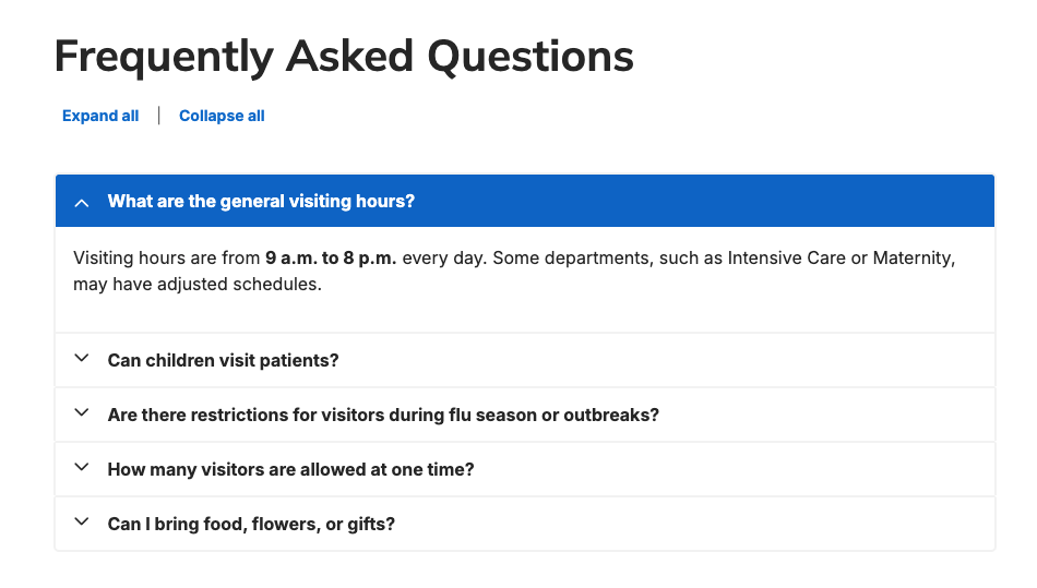
Overview
The FAQ Group component is a specialized accordion designed for FAQ content. Key differences from regular accordion components include:
- Ability to expand/collapse all FAQs at once
- Ability to set all FAQs to expanded by default
- FAQ schema markup that helps search engines show FAQ-rich snippets
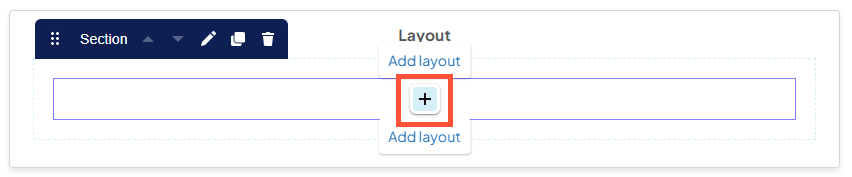
Adding a new FAQ Group
-
Hover the mouse over an empty section in a layout, then click the + icon that appears.
-
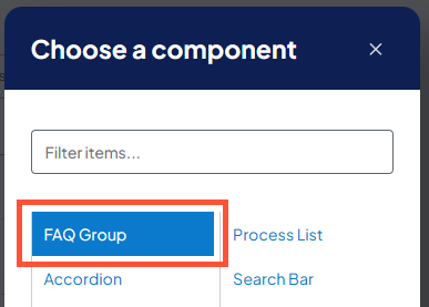
In the Choose a component window that appears, click "FAQ Group".
Configuring a new FAQ Group
- Heading: Enter the header text that appears at the top of the FAQ Group accordion.
- Accordion size: Select the size (height) of the collapsible accordion panels. Options are "regular" or "small".
- Accordion Style: Visual style of the accordion. Options are "regular" or "ghost". Ghost style accordions have no fill color.
- Include FAQ schema markup: Adds structured data to help search engines display FAQ rich snippets in search results.
- Expand all answers by default: All answers will be visible (i.e., all accordion panes will be expanded) when the page loads.
- Show expand/collapse all controls: Adds buttons to expand or collapse all answers at once.
Adding FAQs to the FAQ Group
- Title (Question): Enter the FAQ to be answered here.
- Pane (Answer): Enter the FAQ answer details here.
- Collapse: Collapses the corresponding FAQ question and answer in the Create new FAQ Group window. The button label will change to Edit and can be used to re-expand it.
- Add FAQ Item: Adds another empty FAQ pane to the list.
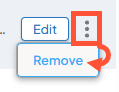
Removing an FAQ
-
Click the 3 dot menu next to the Edit/Collapse button, then click Remove.
Best practices
- Use FAQ Group accordions for FAQ information only. For other types of information, you have the option to use a DXE Accordion.
- FAQs generally have short, concise answers. If the content in an FAQ requires scrolling, consider whether it needs its own Post.
Related Help Content
 DXE: Adding content
Reference: Posts
OverviewA "Post" is one of the content types you can add to your website. In general, it is best used to ...
DXE: Adding content
Providers
OverviewA “provider” is a person in your medical organization that practices medicine on patients. DX...
DXE: Adding content
How-to: Upload Hospital Price Transparency files to DXE
OverviewUnder the Centers for Medicare & Medicaid Services (CMS) Hospital Price Transparency requirements...
DXE: Adding content
Services
Similar to a standard layout, the Services content type gives you an easy, templatized way to build pages...
DXE: Adding content
Using Hidden Blocks
SummaryWhen blocks are assigned to any other region on the page, they will appear only in that region (an...
DXE: Builder basics
Component Library
The “Component Library” is where you can view and test how different elements would look and behave i...