Summary
A standard layout page is a simplified way to create a content page for your site. Basic features can be customized in an easy-to-use template. This is a fast, easy way to create a professional new content page for your site. It’s a great choice for presenting content in a standard format that’s easy to read and digest.
Creating a Standard layout Page
From the homepage, under Add content, click Standard layout.
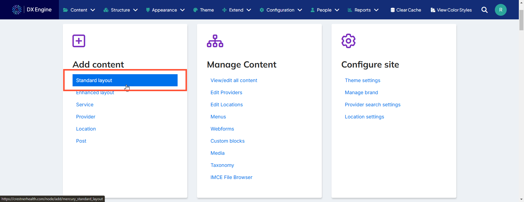
This navigates to the Standard Layout creation template.
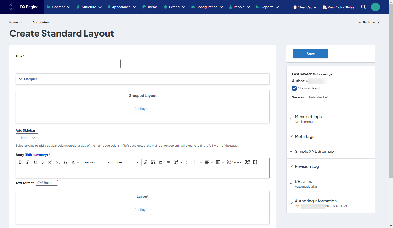
Available fields:
- Title
- Marquee (optional)
- Content
- Call to action
- Flexible links
- Media
- Settings
- Sidebar (optional)
- Sidebar location
- Body
- Summary (optional)
- Additional Sections (see Additional Sections below)
- Layout
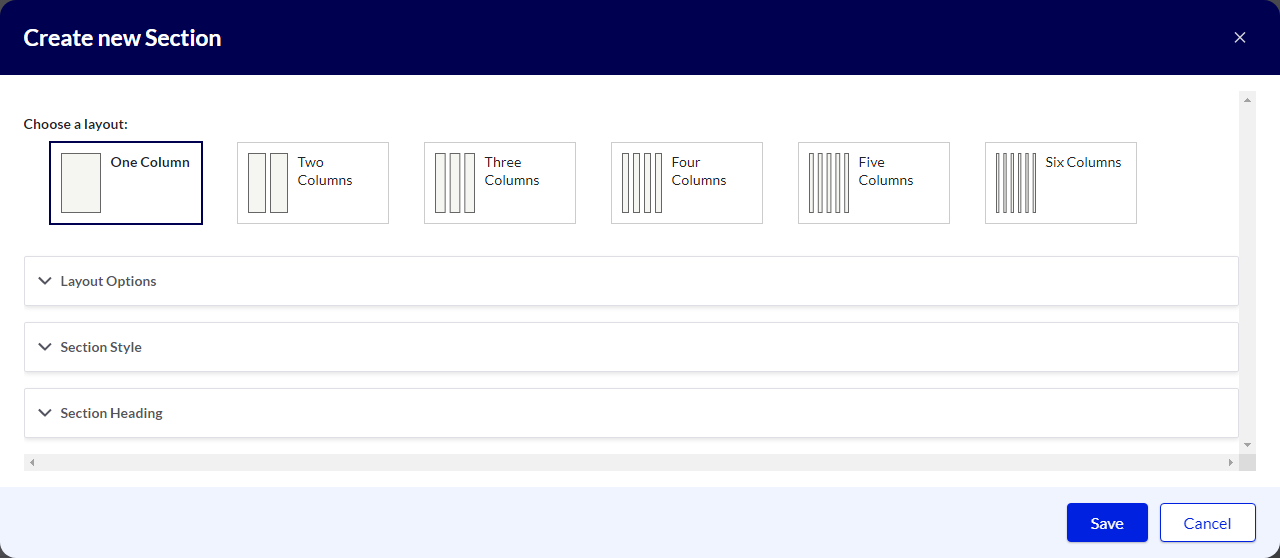
Additional Sections
Adding a section is a placeholder for more types of content (including regular body text). You can add a section that is up to six separate columns across. A different component can be added to each column by clicking the + button inside the column itself.
Types of components that can be added into sections:
- Accordion: Section that can be expanded or collapsed (hidden) using the mouse
- Accordion size, style, behavior (single or multiple), title and body can all be customized.
- Multiple panes can be added in the same section using the Add Accordion Pane button. If “multiple” is selected in slide behavior, all panes will expand/contract at the same time.
- Process List: Element used specifically for breaking out steps in a process
- List numbering and orientation (horizontal or vertical) can be customized. Each step requires a title and summary. An external link can also be added to the step. Additional steps can be added using the Add Process List Step button.
- Card: Self-contained frame including information and possible CTA
- Card title and body is mandatory. Orientation and media (image or video) can be customized. Links can also be added and customized. More links can be added to the same card using the Add Card Link button.
- Slideshow: Collection of images displayed one at a time with slide controls
- Navigation arrows, thumbnails, navigation strip, caption position/background color/opacity can be customized. At least one slide is mandatory. Slide description can be added. More slides can be added using the Add Slide button.
- Description List: Element used for defining terms that are used throughout the site (like a glossary)
- Description Terms and Detail can be added. More entries can be added using the Add Description List Element button. Dividers and icons can also be added.
- Tabs: Headers that can be clicked to change the information displayed in the body area
- Tab style can be customized. Tab title and panel (body) is mandatory for each tab. More tabs can be added using the Add Tab Panel button.
- Block Embed: Search box to select a custom block to place in the section.
- Blocks can be configured by clicking Custom Blocks on the DXE homepage.
- Text: Simple text box
- Only the text can be customized.
- Image: Basic embedded image
- Width, border, border radius and shadow effect can all be customized.
- Webform: Set of fields that can be filled out by the user and submitted to send data to a destination
- This option is only used to select previously created webforms. Click Structure > Webforms in the DXE menu to administer webforms.
- Enter the title of an existing web form in the Form field and select from the quick search results.
- Form status (open, closed, scheduled) and background color can be customized.
- Submission data must be defined using YAML code.
- Image Gallery: Several images displayed together in a gallery Gallery caption can be customized.
- At least one image is mandatory. More images can be added using the Add Image Gallery Item button.
- Video: Embedded video
- Thumbnail can be customized. You can also use an embed code. Background color and play control color/opacity can be customized.
