A "post" is one of the content types you can add to your website. In general, it is best used to hold information for bodies of knowledge intended to grow or change over time. Posts are intended to work together: each post should cover a singular topic (perhaps links to other relevant posts), and all posts are organized into a searchable collective. New posts can be created and integrated into the collective. Support articles and news stories are a few examples of content best suited to posts.
Posts can use taxonomy to be categorized, tagged, and have an author identified. When users search your site content, they can filter by categories, tags, and authors. This makes it easier for users to find the exact information they need.
Starting a New Post
-
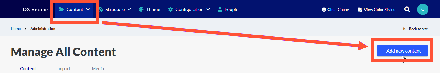
Click Content in the DXE menu, then click + Add new content.
- Fill out the content fields:
- Title: Title of the post, appears in the post headline.
- Post Type: Categorization for the post. Select a category for the post by clicking the dropdown. Setting a post type for your posts allows users to filter post search results based on post type.
- Thumbnail Image: Thumbnail image will be shown on landing pages and search results pages; as well as the Open Graph Image tag.
- A minimum width of 600 pixels is recommended according to Open Graph specifications.
- One file only.
- 300 KB limit.
- Allowed types: png gif jpg.
- Marquee: Title at the top of the post. These fields are optional, you would only fill them out if you want the post title to look different than default behavior.
- Marquee Headline: Text for the title of the post. If blank, value in Title field is used.
- Text color: Custom text color for the Marquee content.
- Background Image: Use different image for background if desired.
- One file only.
- 700 KB limit.
- Allowed types: png gif jpg jpeg.
- Featured Image: Focal point of the marquee and displays below the heading. This will be used as the thumbnail and Open Graph images, unless a separate thumbnail image is added.
- One file only.
- 500 KB limit.
- Allowed types: png gif jpg jpeg.
- General Settings: Define a color, opacity and blend mode for an optional overlay over the background image and behind the text. Default behavior is 100% transparent.
- Taxonomy: Categories and Tags for the post that can be filtered for in search. An Author can also be set. This can help users find this post by narrowing down results to posts with matching taxonomy.
- Taxonomy categories and tags can be configured by clicking Structure > Taxonomy in the DXE menu.
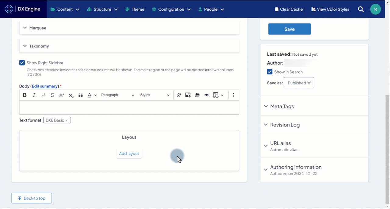
- Show Right Sidebar: Checkbox checked indicates that sidebar column will be shown. The main region of the page will be divided into two columns (70 / 30).
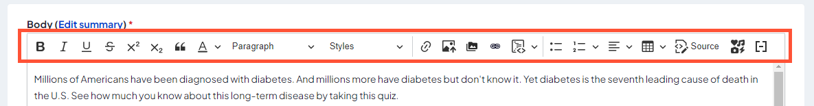
- Body: Text/HTML body of the post (see Editing the body).
- Layout: Layouts can be added (see Adding layouts).
- Display Post Date: Checkbox, when checked, displays the publish date of the Post in the heading.
Editing the body
The Body field contains the information you want to convey to the user when they read the article, including any images or embedded content. Type/place them directly in the body using the tools shown below:
| Function | Icon | Description |
|---|---|---|
| Bold |  |
Makes selected text bold. |
| Italic |  |
Makes selected text italic. |
| Underline |  |
Underlines the selected text. |
| Strikethrough |  |
Crosses out the selected text. |
| Superscript |  |
Changes the selected text to superscript (shrinks and aligns to top edge of regular text). |
| Subscript |  |
Changes the selected text to subscript (shrinks and aligns to bottom edge of regular text). |
| Blockquote |  |
Changes the selected text to a blockquote. A blockquote separates the text to its own paragraph with unique margins and formatting. |
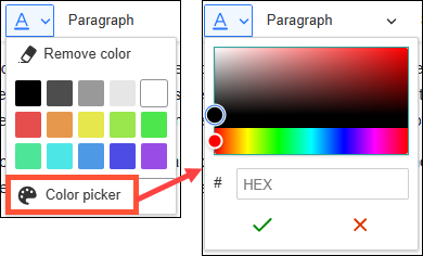
| Font color |  |
Changes the selected text to a specific color. Click the dropdown to show/select a standard color. Click Color picker to select from hue/saturation spectrums or input an exact hex code. Click Remove color to remove a set custom color from the selected font.
|
| Paragraph/header type | 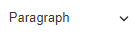 |
Changes the selected text to a specific paragraph or header type. Click the dropdown to select plain paragraph text or a header level. The formatting for each selection here is defined in the Theme settings. |
| Style | 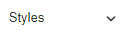 |
Adds styling to the selected text. Click the dropdown to see the options. Options under "Text styles" are button styles that change links into buttons. |
| Link |  |
Adds a link to the selected text. For links to other pages in your DXE site, you can enter the page title and select it from the autocomplete suggestions. For links outside of your DXE site, you can enter the URL directly. |
| Insert image |  |
Adds an image to the post/site from your local drive. Click this, then select an image file to upload. The image will upload to your site and appear in the page. Select the image in the body and click one of the alignment icons to position it on the page as you like. This is the easiest way to add an image to the body. |
| File manager |  |
Opens the file manager for your site. Browse the folder tree to find files and select files to display their linkable URL. You can also upload and manage files here. |
| Insert file links |  |
Opens the file manager. Browse the folders to find the desired file, then click Select.This adds a link to the selected file in the body. The link text is the file name by default, but can be manually changed by clicking in the link itself, typing in a new label and erasing the old label. |
| Code block |  |
Changes the selected text to a code block. Click the dropdown to select which type of code is included (HTML, Javascript, etc). This allows the code to be displayed on page without being rendered, allowing users to easily view, copy and paste them into their own projects. |
| Unordered bullets |  |
Changes the selected text to an unordered bullet. Press Enter at the end of a bullet to add another bullet. |
| Ordered bullets |  |
Changes the selected text to an ordered bullet. Press Enter at the end of a bullet to add another bullet. Click the dropdown for list customization options (starting number, ascending or descending order, etc.) |
| Horizontal alignment |  |
Sets the horizontal alignment of the selected text. Click the dropdown for options (left, center, right, or justify). |
| Insert table |  |
Inserts a table at the cursor position. Click the dropdown to select the table size. After selecting a size, click in each cell to add the desired information. |
| View source |  |
Changes the body from visual preview to HTML source code. Click this to edit the HTML directly. Most of the other text tools will disable while viewing the source. Click Source again to switch back to the initial view. |
| Embedded content |  |
Add an embedded content block to the body at the cursor position. Please see the Embedded content article for more information. |
| Insert token |  |
Click to display possible tokens that can be inserted at the current cursor position. A token is a bracketed term that will populate a dynamic value. When the page is rendered, this term will be replaced with the value. For instance, the token Posts would be replaced by the title of the current page. Click a token in the list to insert it at the cursor position. Close the list when finished. Note: not all tokens are compatible with all pages/content types. If a token doesn’t have a value for that page, the token label will display literally. Click a token in the list to insert it at the cursor position. Close the list when finished. Note: not all tokens are compatible with all pages/content types. If a token doesn’t have a value for that page, the token label will display literally. |
Adding Layouts
Adding a layout is a placeholder section for more types of content (including regular body text). You can add a section that is up to six separate columns across. A different component can be added to each column by clicking the + button inside the column itself.
Types of components that can be added into sections:
- Card: Self-contained frame including information and possible CTA.
- Card title and body is mandatory. Orientation and media (image or video) can be customized. Links can also be added and customized. More links can be added to the same card using the Add Card Link button.
- Text: Simple text box
- Only the text can be customized.
- Image Gallery: Several images displayed together in a gallery.
- Gallery caption can be customized. At least one image is mandatory. More images can be added using the Add Image Gallery Item button.
- Slideshow: Collection of images displayed one at a time with slide controls.
- Navigation arrows, thumbnails, navigation strip, caption position/background color/opacity can be customized. At least one slide is mandatory. Slide description can be added. More slides can be added using the Add Slide button.
- Webform: Set of fields that can be filled out by the user and submitted to send data to a destination.
- This option is only used to select previously created webforms. Click Structure > Webforms in the DXE menu to administer webforms.
- Enter the title of an existing web form in the Form field and select from the quick search results.
- Form status (open, closed, scheduled) and background color can be customized.
- Submission data must be defined using YAML code.
Editing a Post
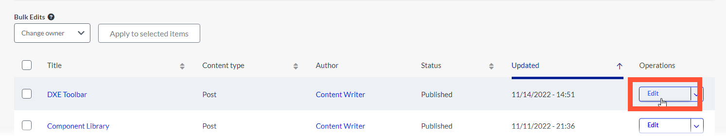
Click Content in the DXE menu to see a list of all existing content, including posts.
Click the post in your list that you want to edit. You can use the filters at the top to help find the post if needed.
Once you find the post, click the Edit button next to it.
You’ll have access to edit the existing content or add new sections. See Starting a New Post above for more detail on the available fields.
Other Operations
Clicking the dropdown arrow next to the Edit button on a post reveals other available operations:
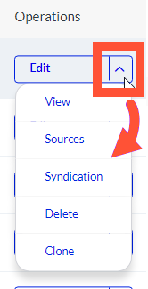
- View: View the post as it would look to users.
- Sources: View whether/how each element in your post is dynamically updated. These are advanced settings that are best left unchanged.
- Syndication: For this post record, manage the syndication of data to individual Data Sources. These are advanced settings that are best left unchanged.
- Delete: Delete the post. You will have to confirm this before the post is deleted.
- Important: After confirming deleting a post, it will be deleted immediately and permanently, so please be sure before proceeding.
- Clone: Clone this post to another new post, retaining all of the content. This can be helpful if you want to maintain a particular format for your posts without having to recreate it.
