The “theme” is where you start applying the basic definitions in the brand to the more recognizable elements and widgets that can be used in your site.
Theme elements are customized using the variables that are set in the brand. For example: let’s say your brand uses a shade of red as its primary color. In your theme, you do not color a button element with that red shade. Instead, you first define that shade of red as your “primary color” in your branding. Then in your theme, you can color the button element by setting its color to the “primary color” option. This ensures consistency throughout your site and makes adjustments much easier to perform.
There is a long menu of elements on the left that you can click and customize, along with an + Import Settings button.
Import Settings
You can click + Import Settings to import all the settings of an existing theme from a different DXE site. This adjusts all options to match the copied DXE site all at once.
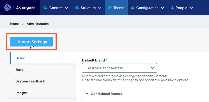
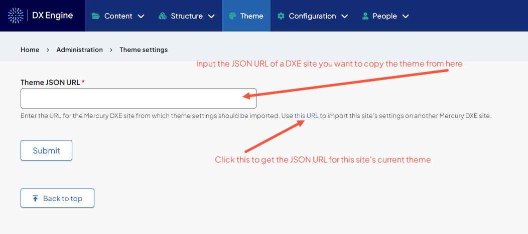
To import a theme, you will need the JSON URL of the site that you want to copy the theme from. You can get the link by clicking + Import Settings on that site.
Set the brand
If not using the import function, always start with setting the brand. This is the first tab on the left menu, and the default landing page when clicking Theme in the Toolbar.
Set the dropdown menu to the brand you want to use. This imports all the definitions set in the brand for use in the theme creation process.
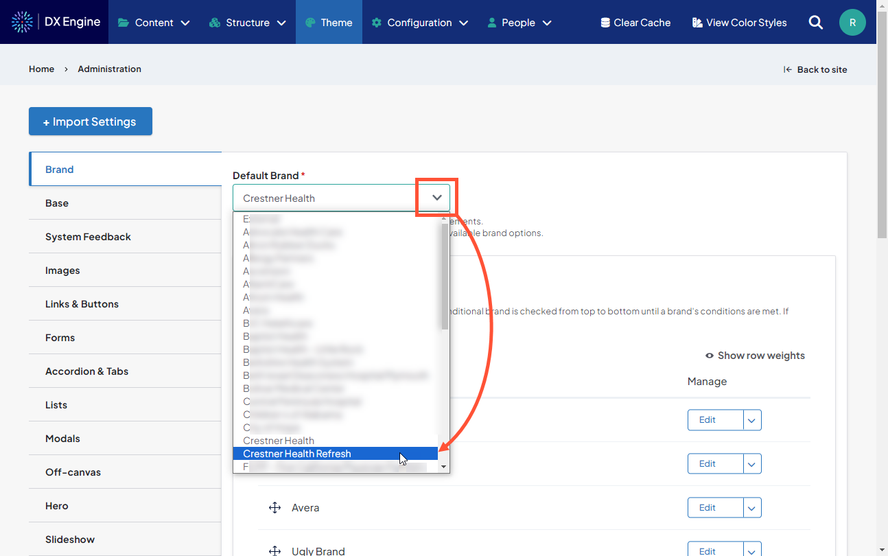
The brand can also be updated here to make a sweeping and precise update throughout the entire site very easily. Each setting in the current brand will be swapped out with the equivalent setting in the new one. For instance, any elements colored using the “primary color” option in the current brand will simply be replaced with the color defined as the “primary color” in the new brand. The theme must be saved before the new brand takes effect.
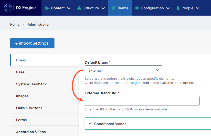
The External option is for copying the brand of another DXE site. It requires acquiring and entering the brand JSON URL for the DXE site you would like to copy.
Conditional Brands
Conditional Brands can also be set to display a different theme's elements depending on criteria you set. For more help with Conditional Brands, please see our Setting Default and Conditional Brands article.
Customizing Theme Elements
Once the brand is established, you can use it to set how different elements in the theme look.
Click an element category in the menu on the left. You’ll navigate to a new page that describes which elements these settings apply to, and contains editable fields below the header.
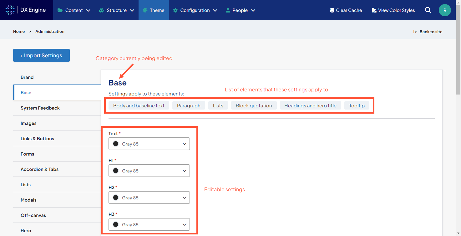
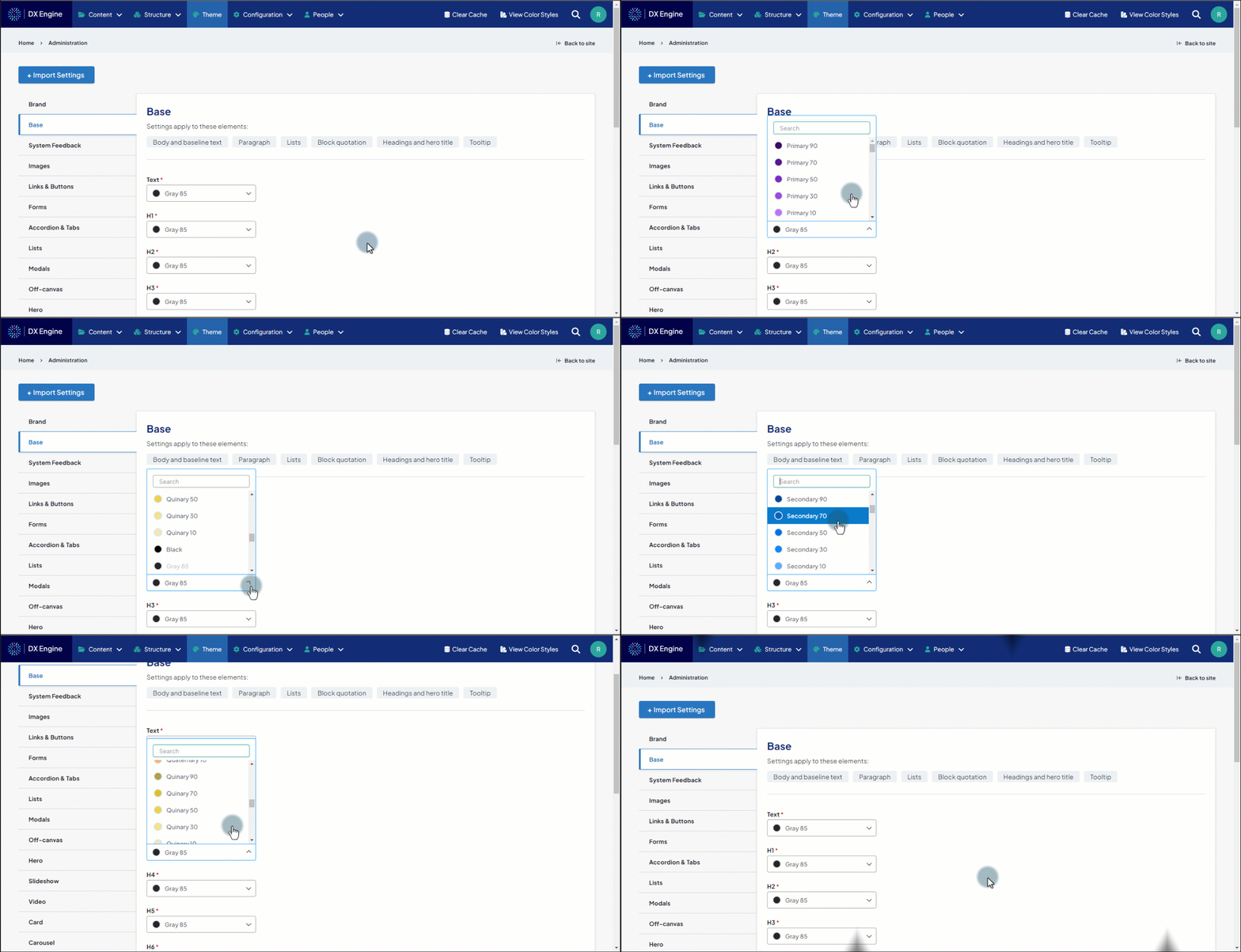
Colors, fonts and formatting are generally set using a dropdown menu. The items in the dropdown menu contain the applicable variables that were set in the brand.
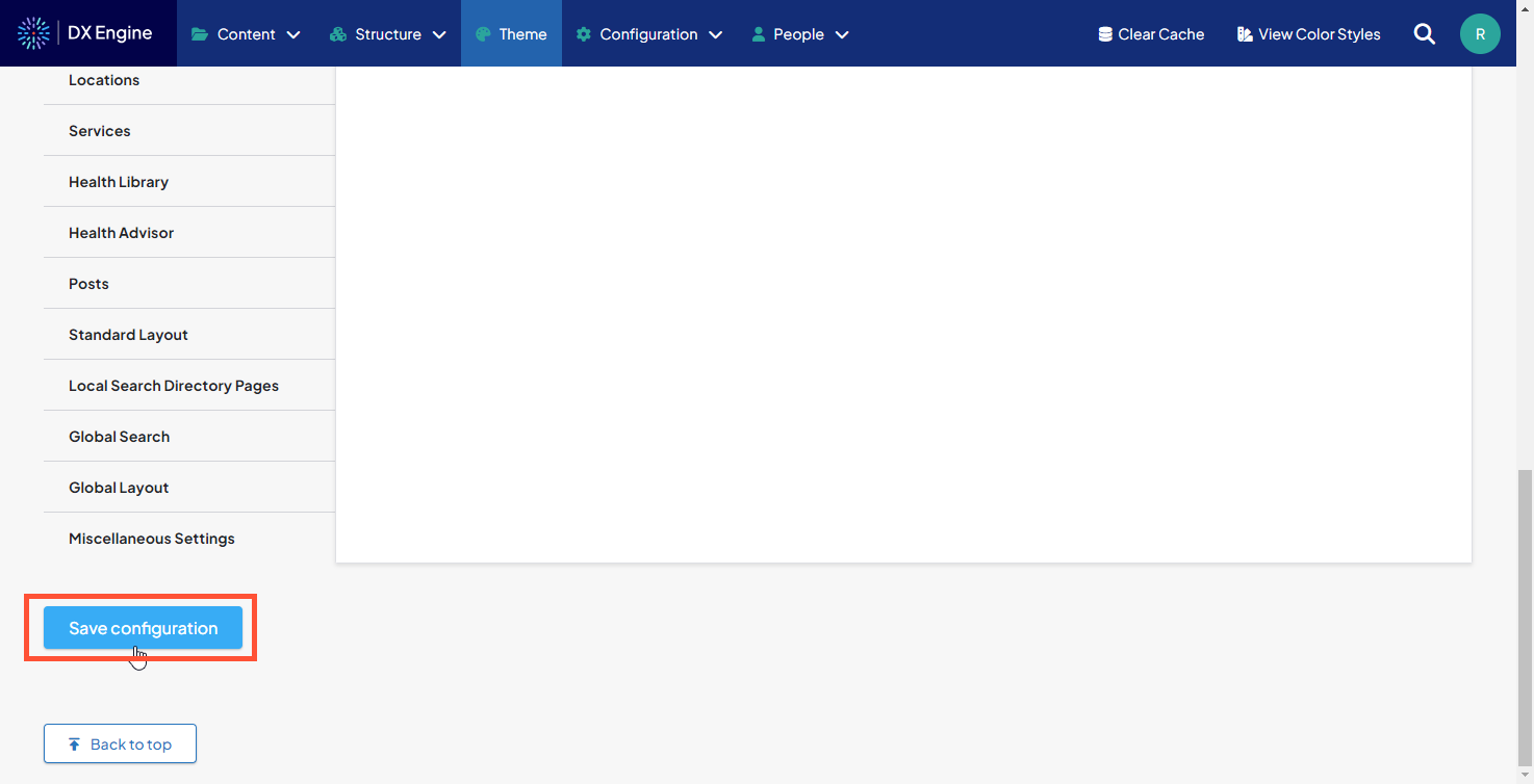
When your settings are ready to apply, click Save configuration.
Element Categories
The following categories appear in the left menu:
- Base: Body and Baseline text, Paragraphs, Lists, Block quotations, Headings and Hero title font, Tooltips
- System Feedback: Badges, Alerts, Notifications, Spinner
- Links & Buttons: Anchor tags, Breadcrumbs, Solid buttons, Ghost buttons, Drop-down menus, Drill-down menus, Pagination
- Forms: Date picker, Inputs, Selections, Textarea, Checkboxes, Radio buttons, Sliders, Suggestive search, Searchable selections
- Accordions & Tabs: Accordions (expandable sections), Tabs Lists: Descriptions lists, Process lists, List groups
- Modals: Modals (popup windows that appear over the body of a page), Image galleries
- Off-canvas: Menu that slides into view from the side
- Hero: Large image with overlaid text, usually at the top of a page, sometimes containing a call to action
- Slideshow: Image slideshow
- Video: Video and play button
- Card: Default card (self contained frame), Provider cards, Location cards, Event cards, News cards, Author cards
- Footer: Page footer Header: Page header
- Sticky Call to Action (CTA): Call to action that hovers on screen in a fixed location, page may scroll behind it
- Providers: Provider search, Provider profile page
- Locations: Location search, Location
- Services: Services search, Service
- Standard Layout: Standard Layout Pages (not Enhanced Layout pages)
- Local Search Directory Pages: Local Search Directory Pages
- Global Search: Global search modal
- Global Layout: Standard Layout Pages, Enhanced Layout Pages, Posts, Services, Local Search Pages, Lists, Cards
- Miscellaneous Settings: Extra options that apply to all pages
