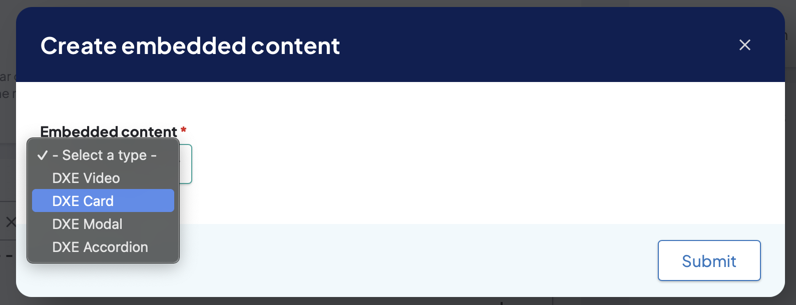
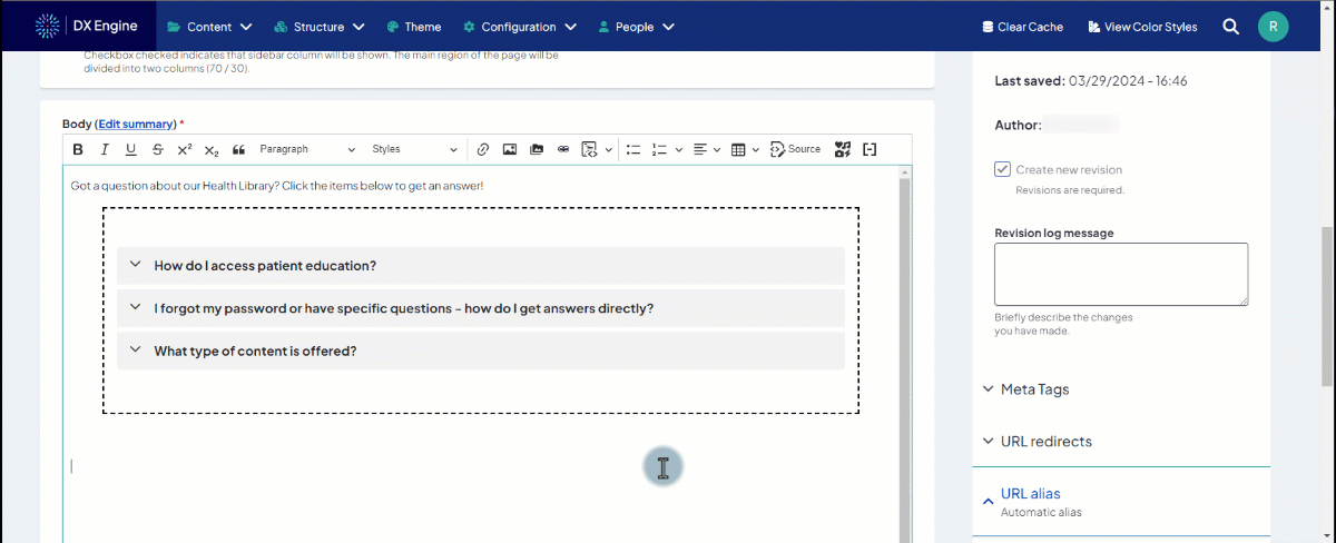
The Embeddable content button in the Body editor allows you to easily add more advanced/interactive content to your page body, with no coding skills required.

Currently, there are 4 options of content to embed:
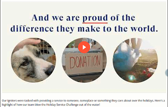
- DXE Video: Playable video embedded in your page or post.
- DXE Card: Self-contained card of information that can include text and a CTA.
- DXE Modal: Window popup that appears over the rest of the page or post when the user clicks the button.
- DXE Accordion: Expandable/collapsible section(s) that show/hide more details on a certain topic.
After selecting/configuring an object and clicking Submit, a non-functional preview will appear in the Body section. To test the function without making the object publicly available, you could save the page in Draft state. However, keep in mind that changing the state of an existing page from Published to Draft will remove it from public availability.
Embedding a DXE Video
When embedding a video, you can set the following options:
- Video content -
- Video Image: Custom poster Image for the video. This is the image that displays before the user plays the video. If you are referencing a YouTube or Vimeo video, you can automatically reference the default thumbnail image associated with those videos without uploading a custom image.
- Video Image Alt Tag: Custom alt tag text for the video image.
- Video Upload: Use this to upload a video from local storage to be hosted by DXE.
- Video Embed: Use this to embed a video hosted on YouTube or Vimeo.
- Video URL: Use this to embed a video file hosted elsewhere. You will need to be able to link directly to the .mp4, .webm, or .ogg file.
- Style settings -
- Background color: Set a custom background color of the video component.
- Play Background color: Set a custom background color of the play button
- Play Button Opacity: Set a custom alpha transparency of the play button. This is a numerical entry that corresponds to the percentage of opacity (i.e. "0" is 0% opaque, meaning the button will be completely transparent; "100" is 100% opaque).
- A color must be set in the Play Background color field for this setting to have any effect.
- Play color: Set a custom color of the play icon that appears inside the play button. The icon is always 100% opaque.
Embedding a DXE Card
When embedding a DXE card, you can set the following options:
- Content settings -
- Card Title: General heading for the card.
- Card Body: Short text to appear in the card body.
- Card Links -
- URL: Destination URL of the button in the card. This can be either another page on your site, or an external URL. If another page on your site is entered and selected, this field will display the title of that page and the node ID in parentheses (e.g., "Heart & Vascular (145)").
- Link text: The text label that displays for the link.
- Link Style: Optional button styling for text links. Options are -None -, standard, ghost, or ghost-white.
- Full Width: Checkbox for making the link span the full width of the card.
- Add Card Link: Click to add a second link to the card with the same fields as above.
- Card Orientation: Orientation of the card. Options are - None -, horizontal, or vertical. Horizontal adjusts the card's width to be wider than its height and places the text (headline, paragraph, links) to the right of the image.
- Media -
- Image: Upload an image to be displayed in the card.
- Image Inset: Checkbox for constraining the image to fit within the card body. Default behavior is unchecked; image spans the full width of the card.
- Image Height: Set a maximum height (in pixels) for the image. Only applicable when the card orientation is vertical.
- Custom Card Classes: Advanced users only. Add one or more HTML class names to this card; separate multiple class names with a space.
Embedding a DXE Modal
When embedding a modal, you can set the following options:
- Modal button trigger settings -
- Button text: Enter the label to appear on the button.
- Button style: Set how the button should appear on the page. Choose Basic if you want the to render the button as a simple text link.
- Button size: Set how large the button should appear.
- Button size is only applicable when Button style is set to Primary or Ghost.
- Modal settings -
- Modal headline: Enter the headline for the modal.
- Modal content: Enter the body text to appear on the modal. This field can accept images and HTML, but you cannot use the Embeddable content button to nest another embeddable content object inside of a modal.
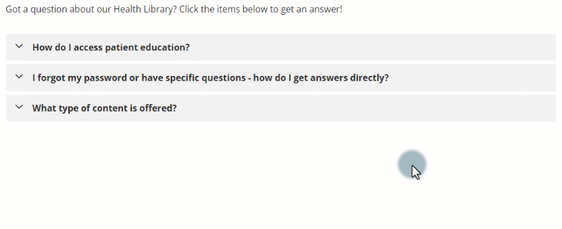
Embedding a DXE Accordion
When embedding an accordion, you can set the following options:
- Accordion settings -
- Accordion size: Select the size (height) of the collapsible accordion panels.
- Accordion style: Visual style of the accordion. You can choose between Regular and Ghost. Regular will set a background color to the accordion panes while Ghost will leave them transparent.
- Expanding behavior: Expanding behavior of accordion panes; when Multiple is chosen, multiple panes can be expanded at the same time.
- First pane open by default: Set the first pane of this accordion to be open when the page loads, ensuring site visitors see the contents.
- Accordion pane -
- Title: Enter the title of the pane that is visible when the pane is collapsed. This also serves as the button a user can click to expand/collapse the pane.
- Panel: Enter the body text to appear in the pane. This field can accept images and HTML, but you cannot use the Embeddable content button to nest another embeddable content object inside of an accordion.
- Remove pane: Remove this accordion pane from the accordion.
- Add pane: Add another accordion to the pane.
Editing an embedded content
To edit an embedded content, you can click the preview of the content in the Body field and click the Embeddable content button again. This will open the embed options in edit mode and allow you to make changes, including switching to a different object.