Release notes: July 2025

Unlock dynamic review sorting for provider profiles!
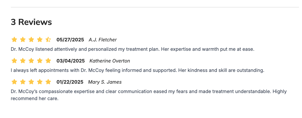
Introducing a new Review Display Order setting that lets you control how reviews are displayed on provider profile pages.
What it is
A brand-new “Review Display Order” option enables you to determine the sequence in which reviews appear.
How it works
- Go to Theme Settings > Providers > Provider Page Settings.
- Find the Review Display Order dropdown select your preferred sort order:
- Newest first (Descending) – most recent reviews on top
- Oldest first (Ascending) – earliest reviews on top
- No selection – retains the original posting order (default)
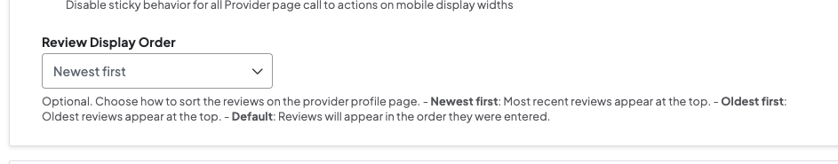
- Save your changes. The chosen sort order will instantly apply to all provider profiles.
Why it matters
By customizing the review order, you can highlight up-to-date feedback, showcase historical testimonials, or maintain chronological authenticity—ensuring clients always see the most impactful reviews first.

Enhanced link descriptions with title attributes
Hover for context—your sub-header menu just got smarter!
What it is
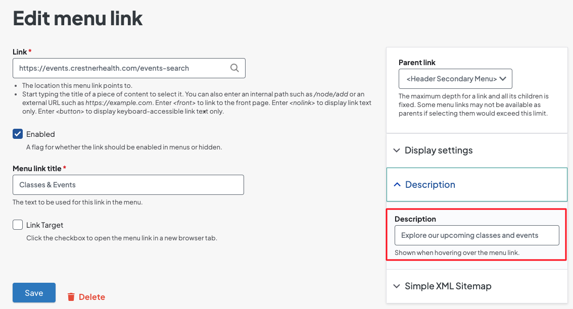
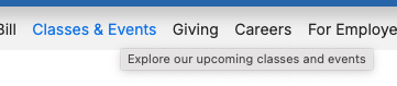
We’ve added HTML title attributes to every link in your site’s sub-header menu, automatically pulling from the link’s Description field.
How it works
- In the Structure > Menus > Edit Menu > Edit menu link screen, enter or update the Description field for each sub-header link.
-
The site will render that text as the link’s title attribute—so when the mouse cursor hovers on the link, the full description pops up.
Why it matters
This update helps improve user confidence by previewing link destinations. Reduce mis-clicks and boost navigation clarity with the enhanced link descriptions.
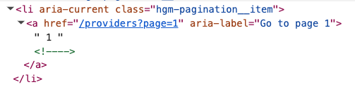
SEO & accessibility boost for provider search pagination
Pages that rank higher—your provider search just got an SEO and accessibility makeover!
What it is
We’ve reworked the pagination component on your provider search pages, inserting semantic HTML, proper HREFs, and ARIA labels on every page link.
How it works
- Standard pagination markup now includes <nav> landmarks and <a href> links with aria-label="Page X".
- No change needed on your end—just publish and benefit instantly.
Why it matters
- Search engines better crawl and index deeper pages.
- Screen-reader users can announce “Page 3 of 10,” improving accessibility and discoverability.
Landmark ARIA labels for header & footer
Skip to it—assistive users can now jump straight to header and footer regions.
What it is
We’ve tagged your site’s <header> and <footer> (and the footer’s parent <section>) with role and aria-label attributes to identify them as landmarks.
How it works
-
The <header> tag now includes a role and aria-label attribute.

-
The <footer> and its parent <section> tag now include an aria-label attribute.

- No setup required—labels appear live after deployment.
Why it matters
Screen-reader users can skip directly to navigation, content, or footer regions of a page.
Keyboard-friendly A–Z browse on services page
Tab, arrow, browse—your A–Z services list now plays nicely with keyboards.
What it is
We’ve integrated full keyboard navigation into the Services landing page’s alphabet browse component.
How it works
- Tab to the alphabet list, then use left/right arrow keys to move between letters.
- Press Enter or Space to filter services by that letter
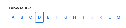
Why it matters
Keyboard navigation empowers users who can’t use a mouse or touch screen. This update speeds up service lookup for power users and accessibility-minded visitors.
Two-column Content Feed cards are here!
You now have more control over your layouts with a brand-new two-column option for Content Feed cards.
What it is
A new Maximum Cards Per Row setting in the Content Feed block that lets you choose two cards per row—in addition to the existing three- and four-card options.
How it works
- Open the Content Feed block’s settings.
- Locate the Maximum Cards Per Row dropdown.
- Select 2 to display exactly two cards side by side.
- The layout remains fully responsive, automatically stacking or resizing cards as the viewport narrows.
Why it matters
This extra flexibility empowers you to place content feeds in tighter spaces without sacrificing readability or design consistency. By tailoring the number of cards to your page’s real estate, you’ll deliver a cleaner, more focused user experience—on any device.
Preload Largest Contentful Paint (LCP) images
Lightning-fast marquee and carousel images are here! Preload LCP images for easy SEO wins
What it is
A new performance enhancement that automatically preloads each page’s Largest Contentful Paint image using responsive image styles and Google-recommended preload tags.
How it works
When rendering, DXE detects your marquee or carousel image as the LCP candidate and injects tags and applies attributes such as a higher priority for optimal loading.
Why it matters
By getting the main visual content in front of users faster, you see lower abandonment rates and a tangible SEO uplift without any manual markup work - all from making these pages faster.
- On small screens, carousel images were stuck to the left edge, but we’ve updated the styling so they now automatically center-align for a polished look.
- Not all services nodes checked to appear on the Services page or in global search were showing up. Now the logic has been improved and respects those Show in Services Page and Show in Search checkboxes, so your content appears exactly where you expect.
- Event occurrences you deleted in DXE in some cases persisted on the site, but we’ve fixed the issue so any removed occurrence is immediately purged from search listings.
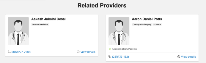
- The “play” icon indicating an available provider video was misaligned in one- and three-column Provider Search layouts; we adjusted the positioning so that the icon now consistently overlays the provider image at the center-top across all column configurations.
- Autocomplete inputs in keyword search fields immediately lost focus when tabbing into them. We corrected the issue so autocomplete inputs can be properly navigated to using the keyboard..
- We corrected a typo in the title attribute of the “Instagram” link in the DXE footer.
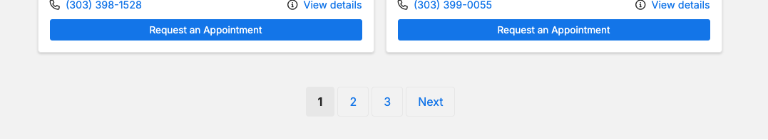
- We resolved a pagination issue in Provider Search on small screens where page links and navigation weren’t displaying correctly, preventing users from browsing beyond the first page. The pagination links now render properly, restoring full multi‐page navigation.
- We fixed a card UI issue in Provider Search’s three-column layout where recent updates caused cards to be incorrectly sized or placed. The card elements have been adjusted to display correctly across all column configurations.
- Depending on your browser’s time zone, search results showed conflicting event times—but now every event listing and detail page uses the time zone you set at creation, guaranteeing consistency.
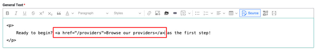
Due to a third-party dependency, the Insert button in the text editor’s link dialog does not respond after you configure link settings. This impacts users ability to add hyperlinks via the editor toolbar’s link button. The workaround until this feature is restored is to click the Source button in the toolbar and manually add link tags around your text or elements.
 Status: A fix is in progress; we’ll share an estimated release date as soon as it’s confirmed.

