Summary
The Listing Grid component allows for the display of a group of related content in a grid-based layout. It’s similar to a DXE Content Feed, but can be placed and managed on an individual page (or “node”).
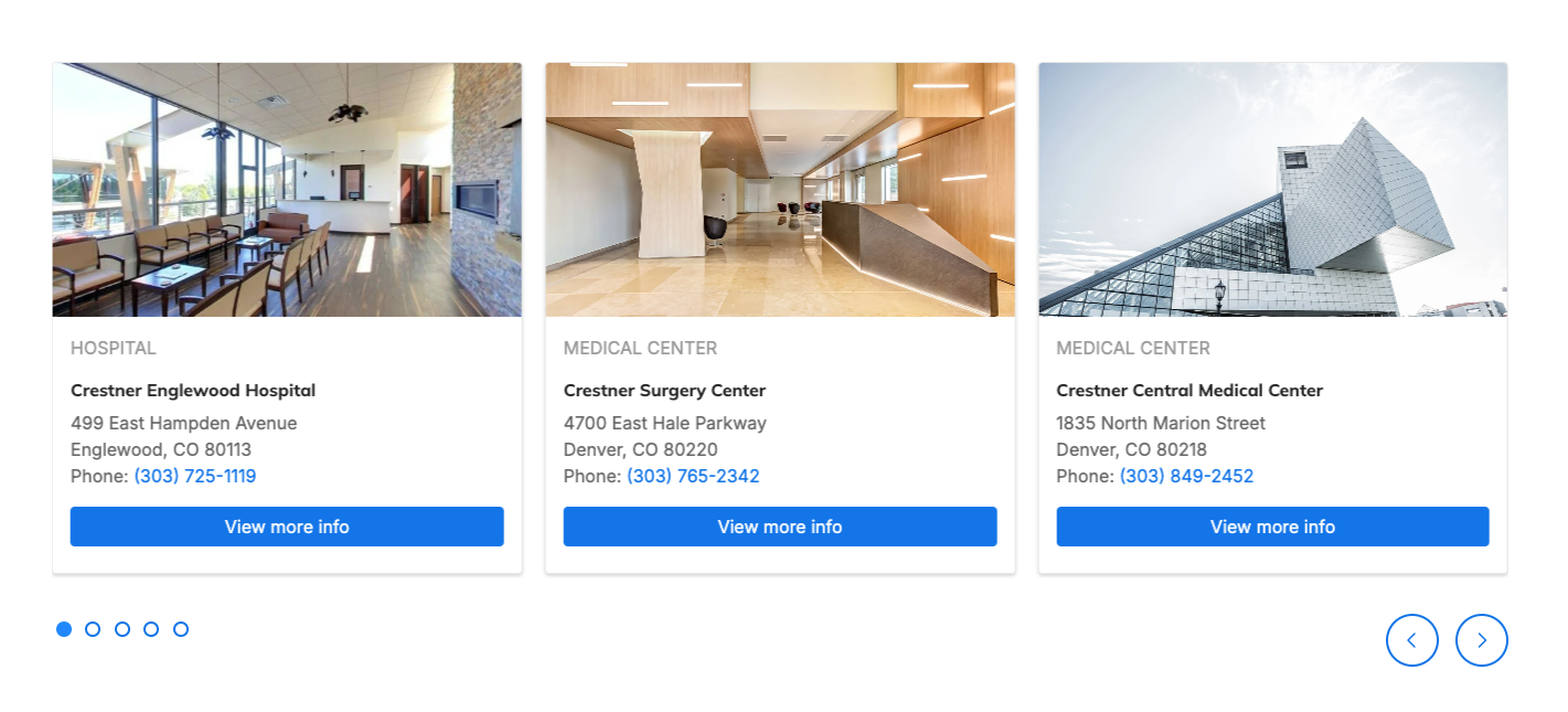
For example, you can place a listing grid featuring a group of specific locations on a single service line page:
Add a Listing Grid
The Listing Grid can be placed inside any Layout region.
- Create a Layout (or use an existing one) and click the + button in one of the regions.
- In the Choose component window, click Listing Grid.
Add content to the Listing Grid
There are two ways to populate the Listing Grid:
- Nodes: You can manually select which pages (“nodes”) will appear in the Listing Grid carousel:
-OR- - Taxonomy: You can select one HealthHub taxonomy term, and any content tagged with that taxonomy will appear in the Listing Grid. Any changes to the content tagged with the taxonomy will update the Listing Grid automatically.
Adding content manually by nodes
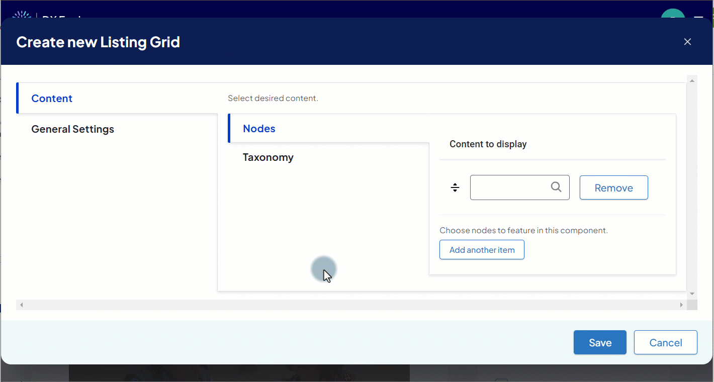
- In the Create new Listing Grid popup, select the Content tab, then the Nodes tab.
- An input box appears under Content to display.
- An input box appears under Content to display.
- Enter the title of the node to add to the Listing Grid.
- Select the node from the list of autocomplete suggestions.
- For each additional item, click Add another item and repeat steps 2-3 in the new input box that appears.
- To rearrange items, click and drag them by the arrows icon.
- To remove any item, click Remove next to the item.
Adjust settings
After setting the content, set up the display and other options.
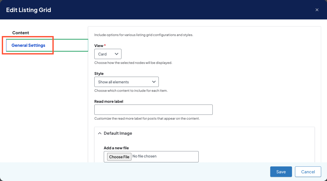
- Click the General Settings tab and set the following:
- View: (Required) Choose the layout of the content in the Listing Grid.
- Options are:
- Card
- List
- List wide
- Carousel
- Note that List is intended for smaller width columns. We recommended using List wide for wider columns.
- Options are:
- Style: Choose what is displayed for each of the items in the Listing Grid.
- Options are:
- Show all elements (default)
- Hide image
- Hide details (this may impact different elements depending on the content type)
- Hide image and details (for a very simplified view).
- Options are:
- Read more label: Set the text label of a card button for a post content type item.
- If nothing is entered, it will use the label set by the Theme Settings.
- Adding text here only sets the label for this Listing Grid. Any other Listing Grids in your site will follow their own settings.
- Default Image: Set the default image for items that don’t have a featured image.
- If nothing is selected, it will use the fallback image configured in Theme Settings.
- Adding an image here only sets the default image for this Listing Grid. Any other Listing Grids in your site will follow their own settings.
- Cards: These field values only apply if the View is set to “Card.”
- Enable Feature: Change the layout of cards so they take up more space and have more visual presence.
- Max cards per row: For card layouts, choose the maximum number of cards that will fit in the component on large screens (default is 3 cards).
- List: These field values only apply if the View is set to “List” or “List wide.”
- Divider: Mark this checkbox to display a divider line between list items
- Image Position: For large screens, choose left or right placement of the preview image. This option currently only applies to Post, Services, and HealthHub (if enabled) content.
- Carousel
- Autoplay Interval: Enter an interval speed (in milliseconds) to enable automatic playback of the carousel slides (must be greater than or equal to 1000).
- Pause: Enable the card carousel to pause on hover; works best when autoplay setting is enabled.
- Animation Duration: Set how long the card carousel rotation animation takes (in milliseconds).
- Animation Timing: Use the dropdown to set whether the rotation animation has a constant speed or accelerates/decelerates for a more natural feel.
- Visible Slides: Set the number of slides that the carousel focuses on at once (default is three).
- Slide Padding: Set the size of the space between carousel slides.
- View: (Required) Choose the layout of the content in the Listing Grid.
- Click Save to save the changes to the Listing Grid when finished configuring.
- Click Save again on the page draft to publish the new/updated Listing Grid.
Tips
- In Card view, all items will have the same height. This helps a user scan the content and highlights that each item is part of the same group.
- It is recommended to use just one content type (all locations, for example) because different content types use unique layouts for the included elements. Mixing content types can create some inconsistency in the individual elements, making it harder for a user to understand what they are seeing.
Related Help Content
 DXE: Adding content
Theme
The “theme” is where you start applying the basic definitions in the brand to the more recognizable e...
DXE: Adding content
Using Hidden Blocks
SummaryWhen blocks are assigned to any other region on the page, they will appear only in that region (an...
DXE: Adding content
Standard layout
SummaryA standard layout page is a simplified way to create a content page for your site. Basic features ...
DXE: Adding content
How-to: Marquee carousel
SummaryWith marquee carousels, you can easily create an automatic or user-controllable slideshow of image...
How-to: Use scheduled transitions
OverviewScheduled transitions are a way to schedule content to update automatically after a selected date...
DXE: Builder basics
Component Library
The “Component Library” is where you can view and test how different elements would look and behave i...