An enhanced layout page is a more freeform way to add a page to your site. Most of the template fields have been removed, allowing you to place elements wherever you like in a number of different layouts. This option is great for making pages that pop and engage the viewer with new, creative visuals.
The Title field is the only standard field here. It is mandatory.
To add more content, click the Add layout button.
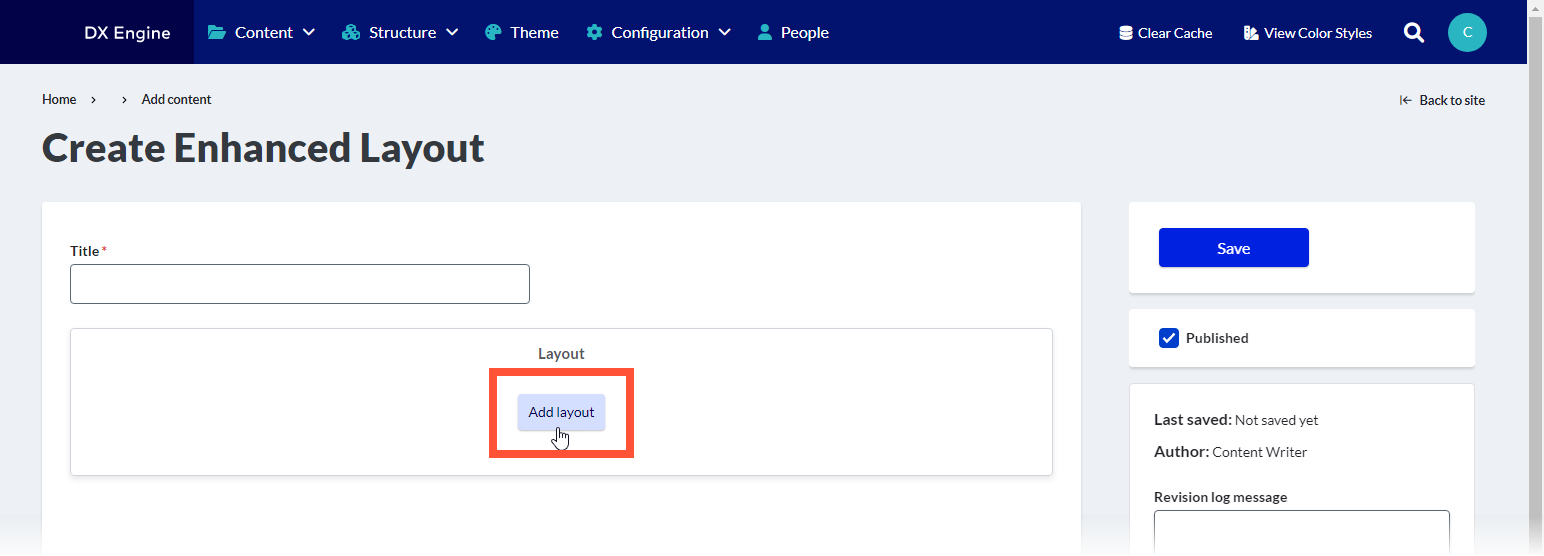
When adding a layout, you can choose from the following options:
- Section: add a new section to the page with a selected layout
- Number of columns (one through six), column widths, background & alignment, and heading can all be customized.
- Sections can have further elements placed inside them (see below).
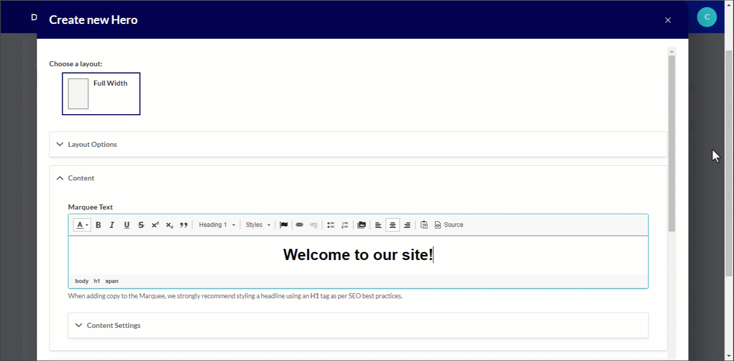
- Hero: add a new hero image
- Marquee text, background media, height, width and overlay formatting can be customized.
- Headline and Media Marquee: A marquee with optional image and descriptive information
- Marquee headline and subheadline, call to action, flexible links, breadcrumbs, background and overlay can be customized. An image or slideshow can be added.
- Editorial Marquee: A marquee that can display multiple links
- Marquee headline, flexible links, background image, featured image, background color, text and overlay can be customized.
- Parallax: Section of the page where the background scrolls at a different rate than the page itself, creating a 3D effect.
- Background opacity, section height, background color and image can all be customized.
After adding any of the above elements and clicking Save on the overlay, you will see a rough preview of the element you have added to the page.
Sections
Adding a section is a placeholder for more types of content (including regular body text). You can add a section that is up to six separate columns across. A different component can be added to each column by clicking the + button inside the column itself.
Types of components that can be added into sections:
- Accordion: Section that can be expanded or collapsed (hidden) using the mouse
- Accordion size, style, behavior (single or multiple), title and body can all be customized.
- Multiple panes can be added in the same section using the Add Accordion Pane button. If “multiple” is selected in slide behavior, all panes will expand/contract at the same time.
- Process List: Element used specifically for breaking out steps in a process
- List numbering and orientation (horizontal or vertical) can be customized. Each step requires a title and summary. An external link can also be added to the step. Additional steps can be added using the Add Process List Step button.
- Card: Self-contained frame including information and possible CTA
- Card title and body is mandatory. Orientation and media (image or video) can be customized. Links can also be added and customized. More links can be added to the same card using the Add Card Link button.
- Slideshow: Collection of images displayed one at a time with slide controls
- Navigation arrows, thumbnails, navigation strip, caption position/background color/opacity can be customized. At least one slide is mandatory.
- Slide description can be added. More slides can be added using the Add Slide button.
- Description List: Element used for defining terms that are used throughout the site (like a glossary)
- Description Terms and Detail can be added. More entries can be added using the Add Description List Element button. Dividers and icons can also be added.
- Tabs: Headers that can be clicked to change the information displayed in the body area
- Tab style can be customized. Tab title and panel (body) is mandatory for each tab. More tabs can be added using the Add Tab Panel button.
- Text: Simple text box
- Only the text can be customized.
- Sticky CTA: Small button that remains fixed on screen if user scrolls, clicking reveals the CTA
- Location on mobile devices, background color, overlay color & opacity, expandable section color, text color. Expandable button label and even external links can be added to the minimized CTA. CTA headline, description, and links can all be added to a CTA Expandable Item, which displays when the CTA is expanded. More buttons can be added using the Add CTA Button button. More expandable items can be added using the Add CTA Expandable Item button.
- Image: Basic embedded image
- Width, border, border radius and shadow effect can all be customized.
- Image Gallery: Several images displayed together in a gallery
- Gallery caption can be customized. At least one image is mandatory. More images can be added using the Add Image Gallery Item button.
- Form: Set of fields that can be filled out by the user and submitted to send data to a destination
- This option is only used to select previously created webforms. Click Structure > Webforms in the DXE menu to administer webforms.
- Enter the title of an existing web form in the Form field and select from the quick search results.
- Form status (open, closed, scheduled) and background color can be customized.
- Submission data must be defined using YAML code.
- Menu: Navigation menu
- Menu heading and contextual menu logic can be customized. If “contextual menu logic” is active, you can also customize whether the menu only displays the menu at the current context, shows the menu item, and shows the child links.
- Video: Embedded video
- Thumbnail can be customized. You can also use an embed code. Background color and play control color/opacity can be customized.
