
Meet the new FAQ Group component
Say hello to the specialized container for FAQ content that groups multiple accordion items together. It builds on the existing standard accordion component for each FAQ item, and adds FAQ-specific, group-level features (controls, heading, and structured data).
What it is
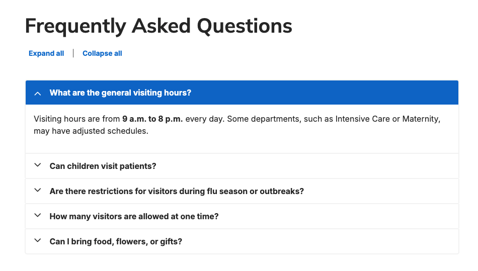
We’ve released a dedicated FAQ Group component — a purpose-built container that bundles multiple FAQ accordion items into a single, configurable block with group-level controls and automatic FAQ page schema generation.
How it works
Using the following settings, configure exactly how FAQs are displayed.
- Placement: Add a new section inside the Layout area of any supporting content type and choose the “FAQ Group” item.
- Structure: The component contains multiple accordion items (each using the standard accordion behavior). The FAQ Group manages them together and can display an optional section heading above the items.
- Available Settings:
- Group-level controls & behaviors:
- Expand/collapse all controls: optional links to open or close every FAQ item at once.
- Expand all answers by default: optional setting to load the component with every FAQ expanded and visible.
- Appearance settings:
- Accordion Size: choose the height/size of each accordion item.
- Accordion Style: choose the visual style for each accordion item.
- SEO & structured data:
- Include FAQ schema markup: when enabled, the component automatically generates FAQ page structured data to help search engines show FAQ-rich snippets. This is enabled by default but can be toggled off.
- Include FAQ schema markup: when enabled, the component automatically generates FAQ page structured data to help search engines show FAQ-rich snippets. This is enabled by default but can be toggled off.
- Group-level controls & behaviors:
Why it matters
- SEO and discoverability: automatic FAQ page schema markup increases the chance of rich snippets in search results, improving visibility and click-through rates — enabled by default for immediate benefit.
- Better authoring and consistency: assemble and style multiple FAQs as a single unit rather than managing standalone accordions one-by-one.
- Improved user experience: optional expand/collapse-all controls and size/style options let you optimize readability and navigation for long FAQ lists.
- Flexible defaults: you keep control — use the default schema and compact presentation, or enable “expand all” and group controls for an overt, fully expanded FAQ page.
Check out the FAQ Group article for more information.

Pagination comes to location search results
Location search results now support pagination, giving you an alternative to endless scrolling improving load times, accessibility, and SEO while making it easier for users to navigate and return to specific results.
What it is
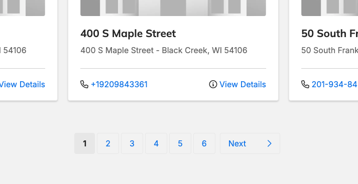
An optional display mode for Location search that shows results page-by-page.
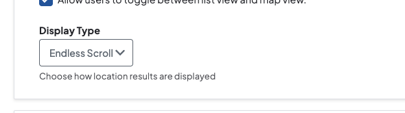
Default behavior remains Endless Scroll; pagination must be enabled on your site.
How it works
- Enabling: In Theme Settings, open the Locations tab, expand the “Locations Search Page” and then the “Views” dropdown. Use the new “Display Type” field to choose between Endless Scroll and Pagination. After selecting Pagination, click the “Save configuration” button to apply the change.
- Behavior:
- 24 results are displayed per page.
- The page title will include the current page number alongside the name for clearer indexing and user context.
- Users can navigate results page-by-page, making it simple to reference or return to specific items.
Why it matters
- Faster initial loads: Pagination reduces the amount of content loaded at once, improving perceived and actual page performance.
- Better accessibility: Page-based navigation is more predictable and easier to use with assistive technologies than endless scrolling.
- Improved SEO and indexing: Page titles with page numbers and smaller paginated pages can be more easily crawled and indexed, increasing discoverability.
- Easier reference and sharing: Users can land on and share a specific page of results, simplifying workflows for support, editing, and repeat visits.
Search that finishes your words — prefix matching for search
Type less, find more: search now supports prefix matches.
What it is
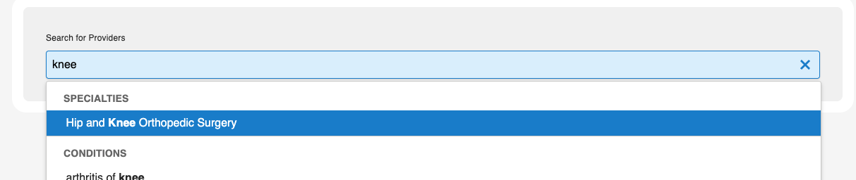
An update to the Provider keyword search that broadens matches by using prefix matching instead of exact-word matching.
How it works
- Before: the query used exact matches.
- After: the query uses a LIKE prefix search.
- A search for a short term (e.g., "lab") will now match indexed words that start with that term (e.g., "laboratory").
- The match is prefix-only: "lab" will not match words where "lab" appears later (e.g., "collaboration").
Why it matters
- Users get more relevant and comprehensive search results for partial terms (fewer missed matches for longer words) with improved discoverability.
- Keeps results focused and reduces false positives by limiting matching to prefixes rather than free substring matching.
Layout Component Enhancements
Additional components are now available across a variety of pages. This gives you richer layout/media options, speeding content creation and improving consistency.
What it is
Additional components are now available for four content types to give editors more layout and media options.
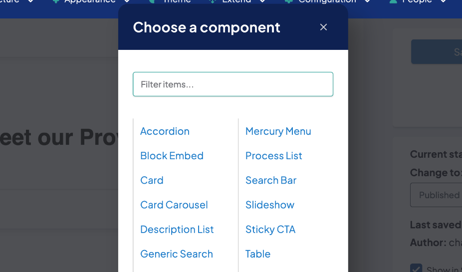
- Standard Layout: Table
- Services: Image, Image gallery, Slideshow, Table, Video
- Post: Description list, Image, Listing grid, Process list, Search bar, Table, Tabs, Video
- Local Search Page: Image, Image carousel, Listing grid, Table, Testimonial carousel
How it works
- Editors will see the newly added components in the component picker when editing content types that received updates. Select and insert them like other existing components.
- The component picker automatically sorts available items alphabetically so components are listed in a predictable, consistent order across content types.
Why it matters
- Faster content composition: new media, layout, and interaction blocks (tables, carousels, tabs, listing grids, videos, etc.) let editors build richer pages without custom development.
- Improved discoverability: more component choices and alphabetical ordering make it easier to find the right block quickly.
- More targeted pages: content types like Services, Posts, and Local Search Page can now better match different content needs (e.g., show testimonials, process steps, or searchable listings) using built-in components.
Aligning experiences: Widgets autocomplete now filters like Provider Search
The autocomplete behavior in the Widgets search bar has changed: selecting a suggested term now applies that term as a filter instead of running a query search. This brings the Widgets search bar in line with the Provider Search experience.
How it works
- When a user selects a suggestion from the autocomplete list, the UI applies a filter for that term (narrowing results) rather than issuing a fresh query for the term.
- The rest of the search flow (typing, submitting full queries, and other filters) remains unchanged.
- No configuration or migration is required; the change is automatic for all users.
Why it matters
- More relevant results: applying a filter focuses results on the suggested context, reducing noisy matches from a broad query.
- Consistent experience: behavior now matches Provider Search, lowering user confusion and training overhead.
- Better discoverability: users who rely on suggestions will see quicker, more targeted updates to the results list.
Hidden sub-menu links no longer capture keyboard focus
Keyboard navigation now skips hidden sub-menu links so only visible controls receive focus, improving accessibility and predictability for keyboard-only and visually impaired users.
What it is
The page navigation flow has been updated so items that are visually hidden are skipped during keyboard navigation.
How it works
When a sub-menu is hidden, its links are excluded from the tab order and cannot be focused using the keyboard. Keyboard-only users will move through visible, interactive elements in a predictable order; hidden elements are ignored until they become visible.
Why it matters
- Improves the experience for keyboard-only users by preventing unexpected focus on invisible controls.
- Makes navigation clearer for sighted users who rely on keyboard navigation and for people with impaired vision.
- Reduces confusion for users with short-term memory limitations by keeping the visible focus indicator aligned with the actual interactive element.
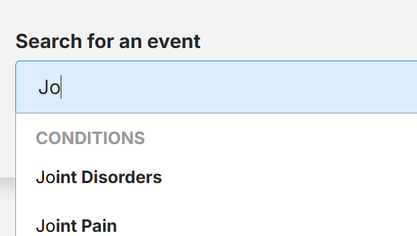
Search autocomplete now returns suggestions after just two characters
Autocomplete, while using search, now shows suggestions after typing just two characters —improving discoverability and speeding up searches.
What it is
An update to autocomplete search: suggestions now appear after a user types just two characters (previously three) so short names return results immediately. This update applies to all autocomplete search fields.
How it works
- As soon as the user enters two characters, the autocomplete engine returns matching suggestions immediately.
- Short provider names (for example, last names like "Wu" or "Li") that previously produced no suggestions will now show relevant results.
Why it matters
- Improves discoverability for providers with 2-character names and reduces cases where users saw no suggestions.
- Speeds up searches and reduces user frustration by surfacing results earlier.
- Lowers friction in finding providers, improving overall search usability and efficiency.
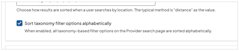
Provider Search — configure filter options order
Giving you the ability to control how your provider search results display, so you can prioritize the most relevant providers.
What it is
A new Theme settings toggle lets you force all provider search filter option lists to display alphabetically. It's a global setting that applies to every filter — when off, option order uses the platform's default. This can make long option lists easier for users to scan and improves consistency across searches.
How it works
- Enable the feature by checking the new setting in Theme → Providers tab → Provider Search Page dropdown → Filters & Sort dropdown → Sort options.
- When checked, every filter’s option list is displayed in alphabetical order. When unchecked, option order follows the existing default sort order.
- This setting is global and cannot be applied to or excluded from individual filters.
Why it matters
- Alphabetical ordering makes long lists of filter options easier and faster for users to scan and select from.
- Provides a simple, controlled way to improve consistency and discoverability across provider search without making per-filter changes.
- Quick to toggle on/off if you prefer the platform’s default ordering for any reason.
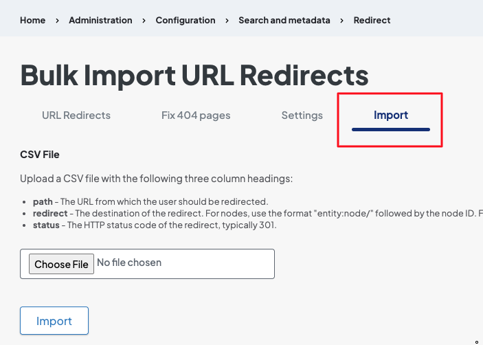
Fix 404 Pages — CSV export and import support
The Fix 404 Pages tool now includes the ability to export a CSV of all nodes that are triggering 404 errors. The exported CSV can be edited and then imported back into your site to apply redirects in bulk. This speeds up large redirect tasks, reduces manual errors, and makes it easier to fix broken links and improve site health and SEO.
What it is
The Fix 404 Pages tool now lets admins export all 404-triggering nodes to a CSV, edit them offline, and re-import the file to apply redirects in bulk.
How it works
- From the toolbar navigate: Configuration → Search and metadata → URL redirects → Fix 404 Pages tab.
- To download all items, click the "Export to CSV" button in the top-right of the table; the CSV download will start automatically.
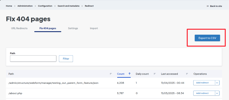
-
Make any necessary changes to the CSV (for example, add target URLs or redirect types) and then re-import it using the "Import" link in the tab section of the Fix 404 Pages screen.
Why it matters
- Saves time by enabling bulk editing of 404 entries instead of handling redirects one-by-one.
- Simplifies large redirect projects and audits, reducing manual work and the chance of errors.
- Helps improve site health and SEO by making it faster to correct broken links and implement proper redirects.

- Older page revisions were not honoring conditional brand styles; they reverted to the default theme instead of displaying the configured brand-specific styling. The correct behavior has been restored so conditional brand styles configured for a node are now applied to older revisions as intended.
- The autocomplete rendering has been corrected: footer search shows the proper suggested terms.
- Alert blocks briefly flickered colors during page load while the Brand color palette was loading, causing a visible styling glitch. We have prevented the color flicker by adjusting how style attributes are generated so alert blocks load with the correct Brand colors immediately.
- Bullet click behavior for Marquee and Card Carousels has been restored so bullets now correctly navigate to the corresponding carousel item.
- When multiple carousels appeared on the same page, keyboard commands (e.g., arrow keys) affected all of them at once instead of just the intended one. Only the carousel currently in focus responds to keyboard input with this update, restoring proper keyboard accessibility and preventing simultaneous navigation of all carousels.
- There was an issue with the text editor not displaying the toolbar, which prevented users from adding or updating content. This issue has been resolved.
Related Help Content

Release notes: May 28, 2026
Check one, find them all: smart filters are here!We’ve upgraded our Provider Search with smart parent/c...
DXE
Feb 2024 release notes
Expedited search index updatePrevious to this update, any changes made to a page or post title (or other ...
DXE
Customizing your site features
Digital Experience Engine (DXE) has all the essential site building options, such as establishing your br...
DXE
Ignite U LIVE Webinar - March 18, 2026
Chad Martin, Marsha Gelber, and Joy O'Brien discuss accessibility updates, the 2026 product roadmap for DXE, and the RHTP initiative.
DXE
Nov 2023 release notes
Ratings on Provider search resultsPreviously users had to click a doctor to be able to see their ratings ...
DXE
Ignite U newsletter
Our newsletter is designed to spark ideas, help you unlock the full value of DXE, and engage and convert ...