
Sharper visuals, simpler workflow: the new content editing experience
We’ve overhauled how images are handled across your content types to ensure your editing process is as seamless as the final result.
What it is
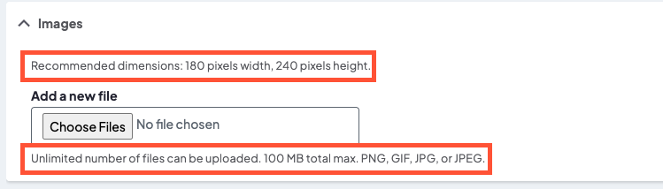
We’ve applied a comprehensive standardization of image fields across DXE. We’ve refreshed labels, updated technical descriptions, and cleaned up the interface to remove redundant "helper text" in favor of clear, human-readable guidance.
How it works
The update streamlines the backend in three key ways:
- Unified naming: Fields like "Thumbnail Image" have been renamed to Featured Image across the board to match industry standards.
- Clearer guidance: Descriptions now explicitly state where an image appears (e.g., Open Graph, search results) and provide specific size and format requirements.
- Decluttered interface: We removed auto-generated system text (like "One file only") to make room for custom, helpful instructions that actually matter to your workflow.
Provider image example
Why it matters
Consistency builds confidence. By aligning how images are labeled and placed—whether you are posting a new Service, a Location, or a Blog Post—we’ve reduced guesswork. You’ll know exactly which dimensions to use and where that image will show up for your audience, leading to a faster editing process and a more professional look across your site.
Small changes, big impact: leveling up digital inclusion
We’ve rolled out a series of targeted accessibility enhancements designed to make DXE more intuitive and navigable for everyone, specifically those using assistive technologies.
What it is
This update is a comprehensive "clean-up" of your site’s structural code and interactive elements. It addresses everything from how screen readers announce navigation menus to how search results are structured, ensuring we meet WCAG (Web Content Accessibility Guidelines) standards more effectively.
How it works
We’ve implemented several technical refinements behind the scenes:
- Semantic labeling: The main navigation is now explicitly labeled as "Primary," and generic "Read more" links now include the specific article title in their metadata (e.g., "Read article: 5 Tips for Heart Health").
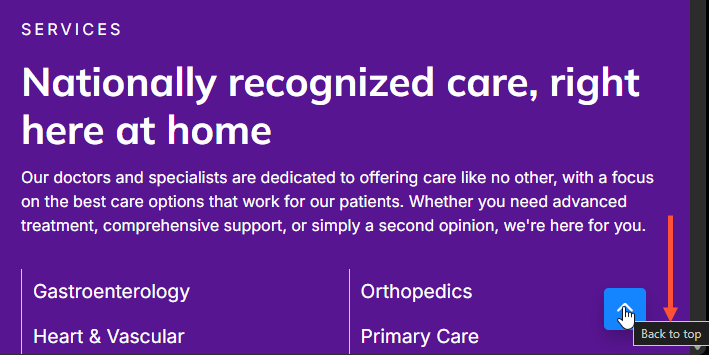
- Icon clarity: We added descriptive text to "Back to top" buttons.
- Alt text: We added alternative text to provider affiliation images so no visual information is lost.
- Code hygiene: We’ve aligned our tabs component with W3C ARIA best practices and eliminated "ghost" containers (empty lists) in search results that previously confused screen readers.
Why it matters
Accessibility isn't just a "nice-to-have"; it’s about equity and clarity. By providing unique link descriptions and proper structural landmarks, users who rely on screen readers to navigate your site with the same speed and confidence as sighted users. These changes reduce "digital noise" and ensure that critical information—like finding a doctor or reading a health update—is available to every member of our community without barriers.
Keeping your data roots: smart taxonomy cleanup arrives
We’ve upgraded our background cleanup process to ensure your content categories stay organized and intact, preventing accidental "pruning" of important parent terms.
What it is
A logic update to how the system identifies and removes unused taxonomy terms. It moves away from a narrow "direct check" to a more comprehensive, hierarchy-aware scan.
How it works
Previously, the system only looked at whether a specific term was being used. If a parent term wasn't used directly—even if its "children" or "grandchildren" terms were—the system would delete it.
The new logic now performs a recursive check:
- It scans for direct references.
- It verifies if any descendant terms are linked to active content.
- If a descendant is in use, the entire lineage (parent terms) is preserved to maintain the site’s structure.
Why it matters
- Data integrity: Prevents "orphaned" child terms by ensuring their parent categories aren't deleted out from under them.
- Structural consistency: Keeps your site navigation and breadcrumbs from breaking due to missing hierarchical levels.
- Zero effort: This is a backend optimization; no user action is required on your part to keep your taxonomy clean and safe.

- We fixed an issue where screen readers redundantly announced "percent" twice. This was caused by an extraneous "%" character within the ARIA label in HealthAdvisor’s progress indicator, which has now been removed to ensure a smoother experience for users relying on assistive technology.
- Key Tile Component: Resolved a bug where an empty <h4> tag was being rendered unnecessarily within the Key Tile on "Services" content types. This cleanup improves HTML structure and prevents potential layout or SEO inconsistencies.
- Broken Links Report: Resolved a critical issue that prevented the report from loading for certain users. The crash was caused by an error handling "orphan links"; the report has been updated to exclude these links, restoring full access and stability.
Related Help Content
 DXE
DXE
Sept 2024 release notes
New component: Listing GridThe new Listing Grid component allows for the display of a group of related co...
DXE
Release notes: December 2024
Introducing Provider Search!A new and improved provider search experience in DXE!What it isThe DXE Provid...
 DXE
DXE
Jan 2023 release notes
Updates to "Find a location"We have revamped how Locations are presented in DXE for a more streamlined an...
DXE
Release notes: October 9, 2025
Breadcrumbs — now clean, consistent, and predictableWe’ve simplified how the current page shows up in...
DXE
Mar 2024 release notes
New Embeddable content button in Body editorWe've added a button to the Body text editor to help you add ...
DXE
Oct 2023 release notes
Browse A-Z section for Services search pageYou can now set Services search pages to show a convenient br...