Overview
The built-in Digital Experience Engine (DXE) Provider Search comes with many customization options that allow you to cultivate the search experience you want for your users.
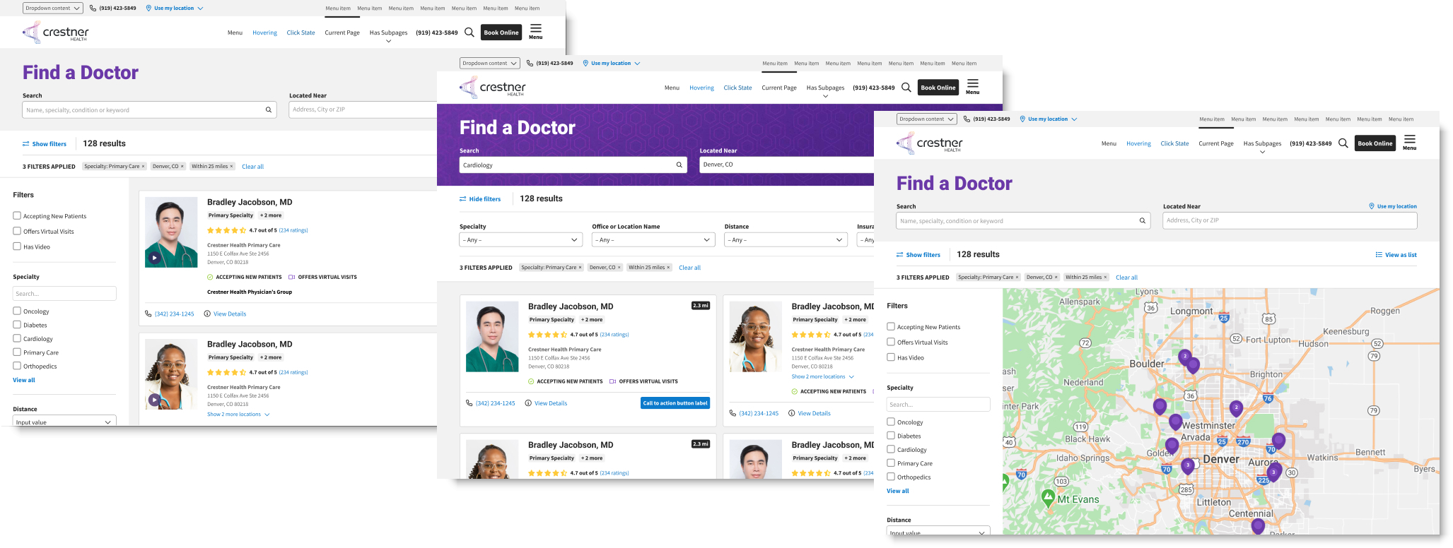
DXE Provider Search will automatically reflect your brand choices (colors, fonts, etc.), however, there are a number of other controls that allow you to modify the search page header, number and type of filters, sorting of results, results per page, display of provider cards, and more. You can set these options to make your Provider Search page as comprehensive or as streamlined as you prefer.
Process
- Click Theme in the Toolbar.
- Click Providers in the tabs on the left.
- Expand the Provider Search Page dropdown.
- Check the Providers Search (Beta) box (if not already checked).
- This step enables the advanced customization options described in this article.
- This step enables the advanced customization options described in this article.
- Customize the Provider Search page options to suit your needs (see Options below).
- Scroll down and click Save configuration.
Options
Click one of the links below to jump to that section:
Heading
Options for the Provider Search page header.
- Marquee heading: Heading for the Provider Search marquee.
- Marquee heading text color: Text color of the Provider Search marquee header.
- Marquee background color: Default background color for Provider Search page marquee.
- Provider Search marquee background image: File upload module to use a custom background image for the Provider Search page marquee.
- Allowed file types: gif, png, jpg, jpeg
- Tile the background image: If set, will repeat the background image to fill the entirety of the marquee background. The uploaded image must be smaller than the marquee for this option to have a visible effect.
Filters & Sort
Options for filtering and sorting search results.
- Keywords: Options for the keyword search box. Keyword searches will scan through several taxonomies for the given search term.
- Enable: When checked, displays the keyword search box and make it available for the user to search providers with.
- Label: Text label that appears above the keyword search box on the Provider Search page.
- Placeholder: Default text that displays inside the keyword search box. This text is removed when a user starts entering a search term.
- Enable provider direct link: When checked, allows the user to select a Provider from the autocomplete suggestions and go directly to that Provider’s page.
- Suggestive results sort order: Sets the order of suggested results that appear below the keyword search box as the user enters a search term, grouped by taxonomy.
- This option shows a list of taxonomies that can be rearranged using drag-and-drop. Drag them into the order you want them to appear in suggested results.
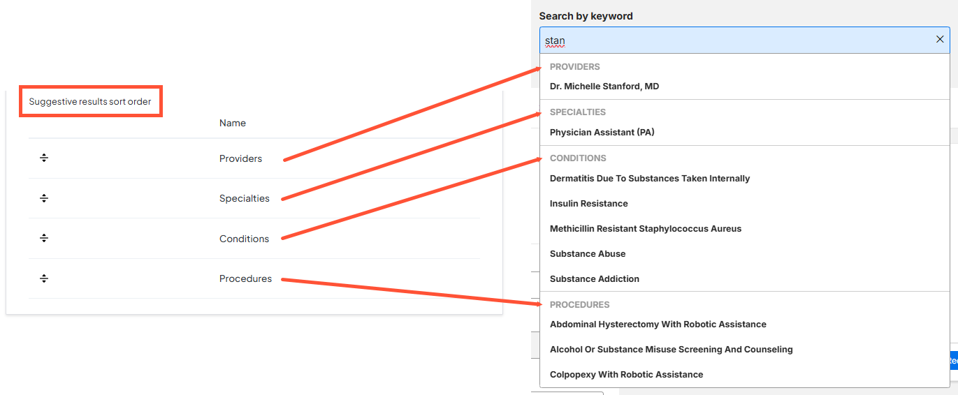
- This option shows a list of taxonomies that can be rearranged using drag-and-drop. Drag them into the order you want them to appear in suggested results.
- Address: Options for the address input box. Users can enter an address here for filtering Providers by Distance (from the user). If the address box is not enabled, users can still filter by Distance if Geolocation is enabled in the Miscellaneous Settings tab in the Theme settings and the user’s address has been collected. Otherwise the Distance filter will not be available to the user on the Provider Search page.
- Enable: When checked, displays the address box that the user can enter their address into.
- Label: Text label that appears above the address input box on the Provider Search page.
- Placeholder: Default text that displays inside the address input box. This text is removed when a user starts entering an address.
- Additional filters: List of extra filters that can be made available to the user for filtering the list of Providers results. The filters can be reordered by dragging and dropping. Each filter can be enabled and customized individually:
- Name: The original label of the filter (cannot be changed).
- Label: The label of the filter as displayed on your Provider Search page.
- Type: Type of filter (cannot be changed).
- Options: Options for the filter are displayed here. Each filter has its own set of options. Possible options are:
- Autocomplete: Allows the user to type in a term and select from a list of suggestions.
- Multiselect: Allows the user to select from a full list of available values.
-
Nested Multiselect: Allows the user to select from a full list of available values. Nested terms appear indented below their parent term. Users can select the parent term to automatically include all nested terms, or select specific nested terms for even more precise results.
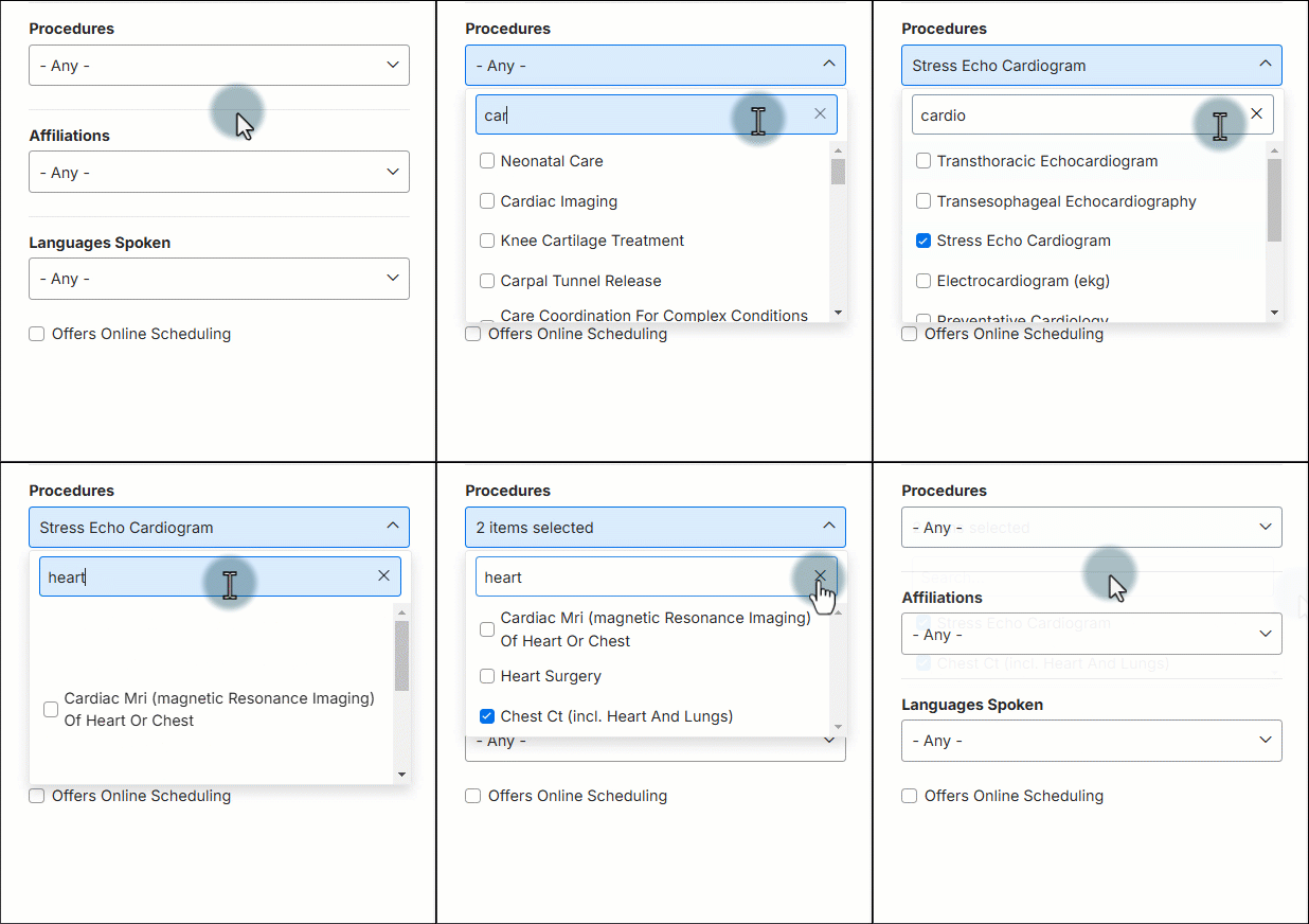
Example of an autocomplete filter 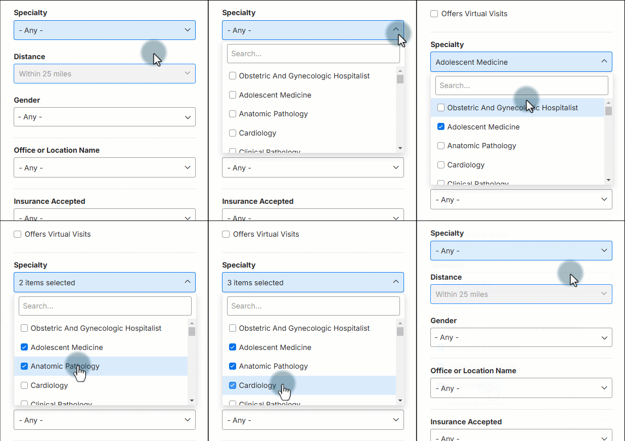
Example of a multiselect filter 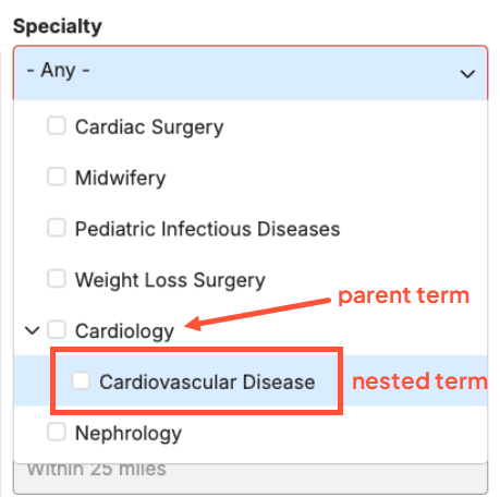
Example of a nested multiselect filter  Note: Multiple selected values in a single filter set will use “OR” logic; meaning a Provider will appear in the results if their information matches any selected value. They do not have to match all selected values.
 - Enabled: When checked, the filter will be available for the user to filter search results.
- Sort options: Options related to sorting the Providers in the search results.
Note: Modifying sort options requires manually entering the proper API key values and is considered a power user option. The default values or on-screen example values are preferred in the vast majority of cases.- Sort Order (default): Choose how results are sorted without any user action. Typical methods include "order" or "title" as the value.
- Sort Order (Keywords): Choose how results are sorted when a user performs a keyword search. You can use a single method like "relevance" or a combination using a comma like "relevance,order".
- Sort Order (Distance): Choose how results are sorted when a user searches by location. The typical method is "distance" as the value.
- Autosuggest options: Options related to the suggested results presented to the user after entering a partial search term.
- Autosuggestion start at: Number of characters that need to be typed before any search suggestions display.
Display
Layout options for displaying Provider Search results on screen.
- Record per page: Maximum number of provider records displayed on a single page.
- Disable map: Prevents users from accessing map view. If left unchecked, users can toggle between list view and map view.
- Default view: The default view presented to the user after performing a search. The user can freely toggle between views by clicking View on Map or View as List.
- Columns (list): Displays the list of Providers as column(s) of cards by default.
-
Map: Displays the list of Providers as pins on a map by default.
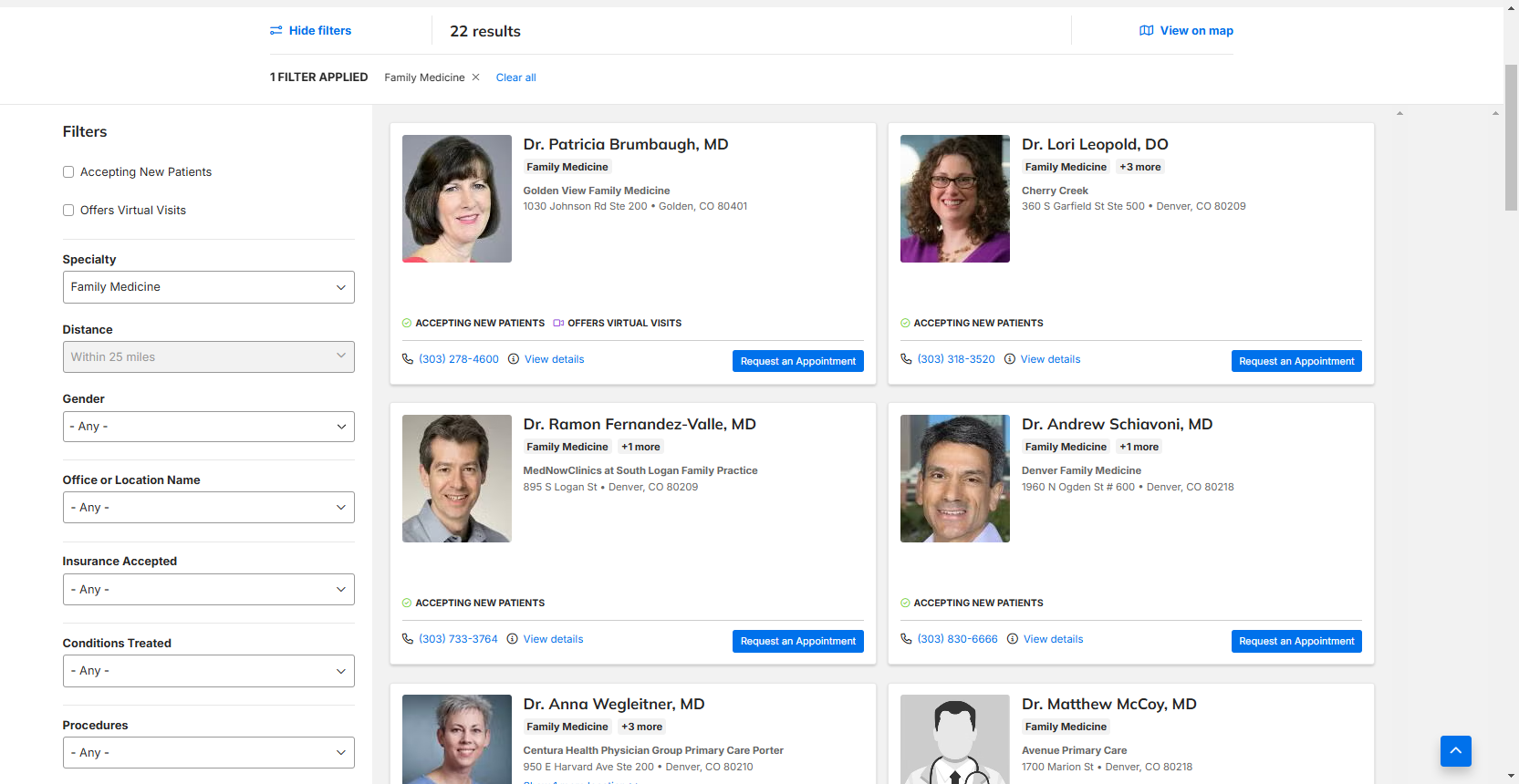
Example of a Columns (list) view 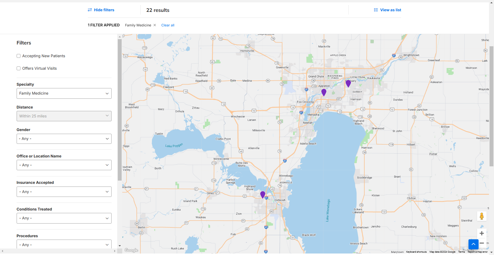
Example of a Map view
- Filter position: Set where the filters are on the Provider Search results page.
- Above results: Set the filters above the results list.
- Sidebar: Set the filters to the left sidebar.
- Defaults Filters to be open upon initial load: When checked, displays the available filters on screen by default. If unchecked, the user must click Show filters to expand the available filters.
- No Results settings: Define how the page behaves when no search results are returned.
- Headline: The header that displays when no results are found.
- Button label: Label for the button/call to action (CTA) that appears when no results are found. By default, the button will clear all filters. This can be changed to redirect to a different URL if desired (see next bullet).
- Button link: Leave blank to keep the default behavior of clearing the search filters. Enter a URL to make the button redirect the user to a different URL.
- Overlay background color: Set the background color for the no results overlay.
- Large Results settings: Define how the page behaves when a large number of search results are returned. These settings are essentially limits that can be added to preserve search performance.
- Handle large data sets (checkbox): When unchecked, does not display results in the interactive map until the user applies a filter.
- Handle large data sets (numerical entry): Set the maximum number of provider locations that can be viewed given any filtered or unfiltered state.
Cards
Options for how each individual result is displayed.
- Number of columns: The maximum number of columns that will display for larger browser widths. The grid will responsively adjust for smaller widths.
- One, Two or Three can be selected.
- Show provider affiliation logo: When selected, shows the Provider’s affiliation logo on their card (when applicable)
- Enable Custom Card: Enables identifying a custom card template. If selected, the Custom Card Template and API Params fields appear and must be entered properly.
Sort tiers
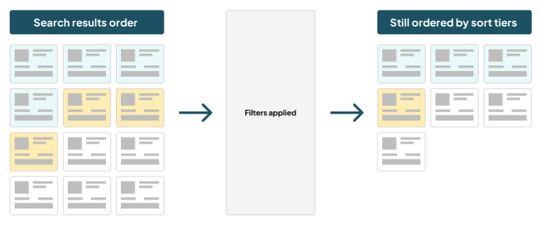
Sort tiers allow you to group and order search results based on specific criteria and display them in a preferred order. Each tier is defined by one or more rules, and each rule is based on a field in the DXE Provider records. Once the tiers are established, the tiers can be set to display in any order you like.
Providers that meet the rule for the first tier will be displayed first in search results. Providers that don’t meet the rule for the first tier, but do meet the rule for the second tier will be displayed next. And so on, until the remaining Providers are displayed last.
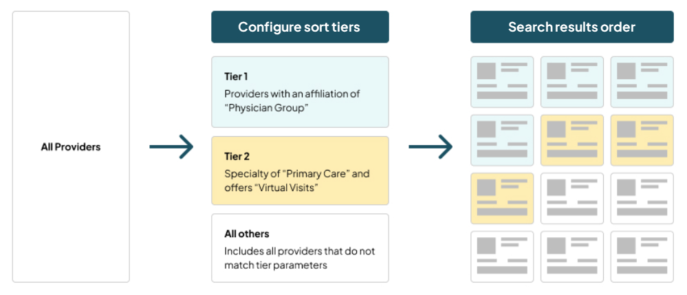
The sort tier priority will still be enforced if a user applies a search filter to their results.
