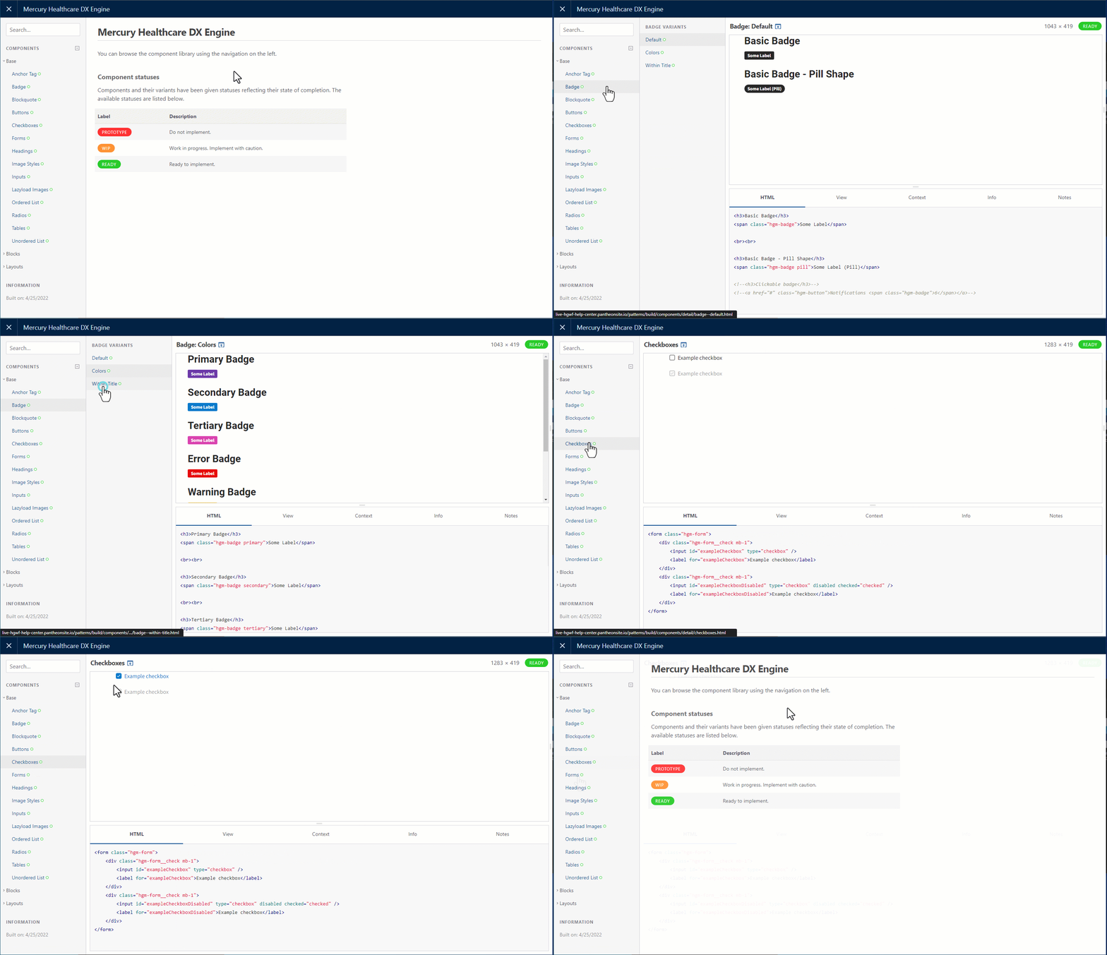
The “Component Library” is where you can view and test how different elements would look and behave in your site.
The components shown here will all be displayed as defined by the theme settings.
To preview an item, select it in the menu on the left. Depending on the item you selected, you may also have to select a variant in a second menu that appears. A preview of the selected item will display in the top right. The code for the item will display below that.

The components you can preview are organized in 3 main categories:
|
Base |
Blocks |
Layout |
|
|---|---|---|---|
| Anchor Tag
|
Accordions
|
Marquee Two Column
|
CTA (Call to action)
|
| Badge
|
Alerts
|
Modals
|
Equal Columns
|
| Blockquote
|
Breadcrumbs
|
Nav Tabs
|
Footer
|
| Buttons
|
Cards
|
Notifications
|
Header
|
| Checkboxes
|
CTA
|
Offcanvas
|
Site Search
|
| Forms
|
Description Lists
|
Pagination
|
|
| Headings
|
Drill Downs
|
Parallax
|
|
| Image Styles
|
Dropdowns
|
Process List
|
|
| Inputs
|
Horizontal Scrollbar
|
Select Search
|
|
| Lazyload Images
|
Key Tiles
|
Slideshow
|
|
| Ordered Lists
|
Light Gallery
|
Spinner
|
|
| Radio Buttons
|
List Groups
|
Tabs
|
|
| Tables
|
Marquee Featured Image
|
Tooltip
|
|
| Unordered Lists
|
Marquee Hero
|
Video
|
|
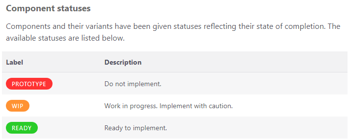
Component Statuses
As noted on the front page of the component library, each component will be tagged with a status.

- Prototype - Do not use this component.
- WIP - Work in progress, implement component with caution
- Ready - Component is ready to implement

