
Source Sync Report for third party providers and locations
Introducing a new module giving you access to audit synced data fields.
What it is
The new Source Sync Report provides a method of auditing changes to nodes when field data for things like providers and locations are updated via a third party API. Those syncing data at regular intervals from Doctor.com, Kyruss, Verge, Symplr or other third parties now have the ability to look up records, see sources, and filter to relevant data.
How it works
When a sync occurs, a new record will be created showing which fields were changed for each updated node (data columns highlighted).
To access the report, click Configuration > Mercury Features > Source Sync Report in the DXE Toolbar.
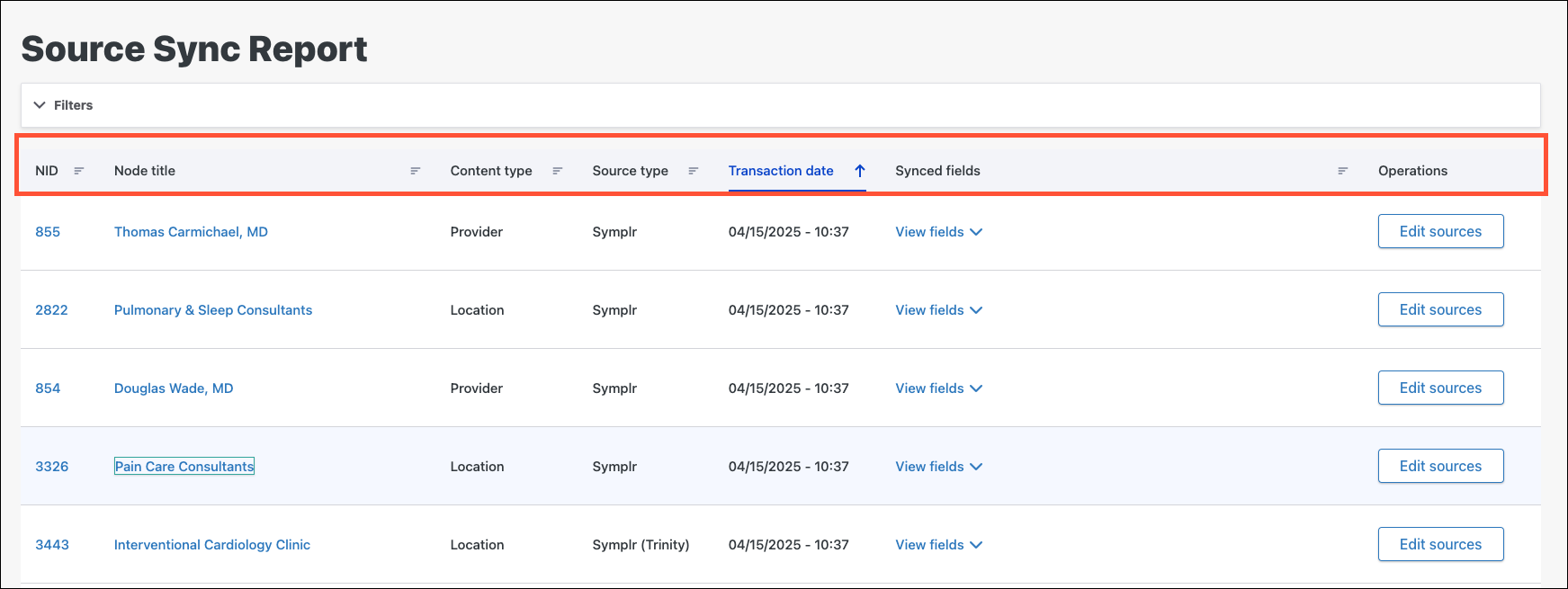
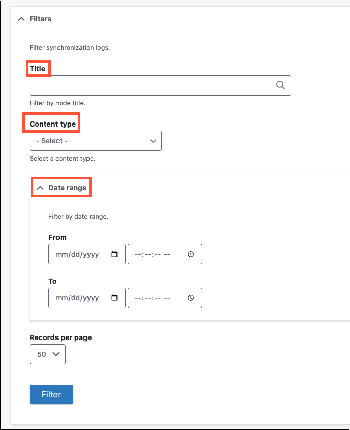
Filter parameters allow you to find a specific sync event by the following:
- Title (node title)
- Content type
- Date range
Why it matters
With this new report, you can now keep better track of when and how synced records are changed, granting full transparency into the source of the updates!

Provider Search: page title configuration added
Take control of your Provider Search pages by customizing the page title.
What it is
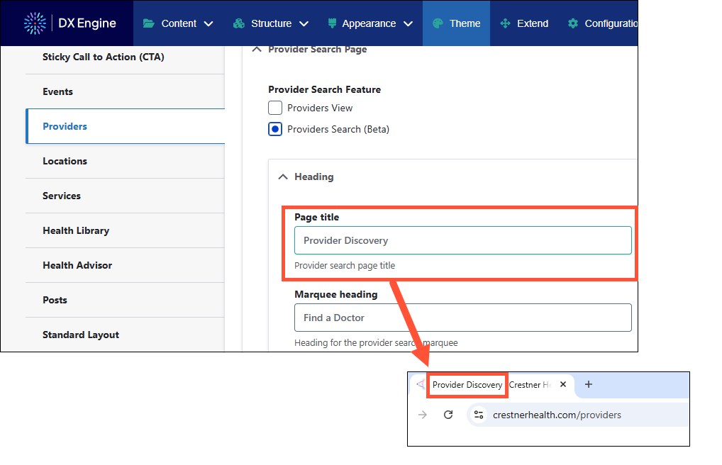
Need to change the page title on your provider search pages? Now, you can input a provider page title that is customized rather than the default “Provider Discovery”.
How it works
Within the Theme settings for Provider Search Pages, a new field under the “Heading” section allows you to configure how visitors see the page title in their browser.
Why it matters
Present your brand in the ways that matter to you, big or small. Controlling how provider search pages look down to the page title helps you build a consistent experience for your site visitors.
Provider Search: Custom Content added to filter region
Introducing Custom Content in the Provider Search filter region—for a more informed search experience.
What it is
Disclaimers and other custom content can now be added to the filter region on provider search pages.
How it works
Within the Theme settings for Provider Search Pages, a Custom Content field has been added that can display text and/or basic HTML below the filters on the DXE Provider Search page. You can use this to add disclaimers or other helpful information to guide visitors to providers.

Why it matters
Whether you need a disclaimer added to your provider search pages or want to add custom content that guides the experience of visitors searching for a provider, you are empowered to add what you need via a new field in Theme settings.
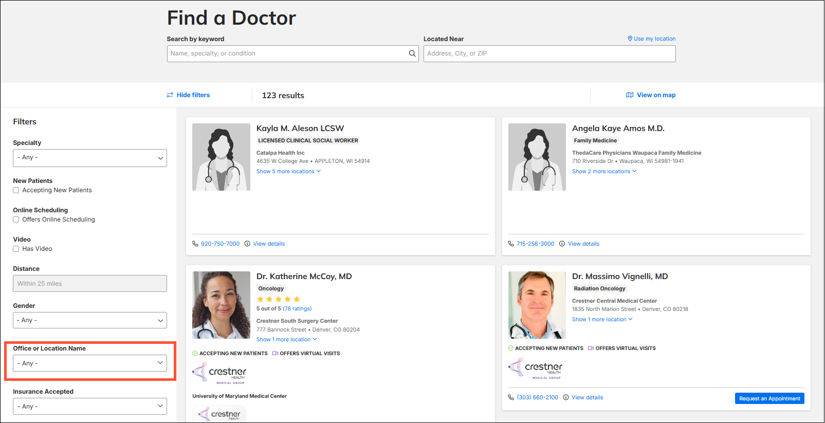
Provider Search: location filter change
Office and Location Name filtering just got more relevant and helpful for your users.
What it is
Rather than showing all published locations set to “show in search”, locations will be shown associated with at least one provider.
How it works
Locations not associated with a provider will no longer show in the “Office and Location Name” filter on the Provider Search page.
Why it matters
Showing only relevant location filters leads to a more consistent and predictable search experience. With this release, we make location filters much more intuitive and useful to visitors by only showing appropriate location(s).
Expandable task tabs when viewing Content
Focus on the content—not the clutter.
What it is
When editing or viewing a page, local tasks showed all available options, which made the page look cluttered. Now these options are hidden with the ability to expand to see all tasks.
How it works
In view or edit mode on a page, expand the caret to see all local tasks associated with the page.
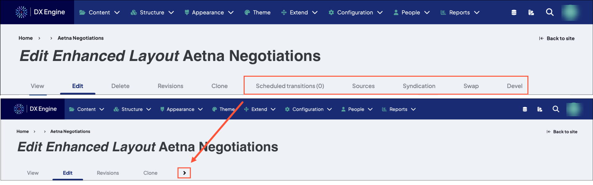
Why it matters
The updated local tasks menu means a cleaner interface while maintaining access to the other local task options.
Show page title when adding a link to a card
Be 100% confident while adding links by seeing the title of the destination right in the UI.
What it is
When editing a card and adding a link, the node ID and page title now show in the editor.
How it works
Rather than just showing the node ID, see the more descriptive page title along with the identifying node ID.
Before:
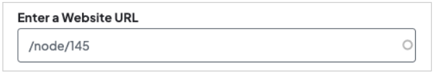
After:
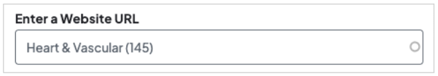
Why it matters
Be confident you are linking the correct place within a card by seeing the page title and node ID.
Updated focus state style for button elements
Site visitors now have better accessibility as we've made buttons easier to see.
What it is
Focus state styles for buttons received improvements to border thickness and placement for better accessibility on light or dark backgrounds.
How it works
In some browsing environments, the buttons were not as accessible before thicker borders and better placement changes. Updated button examples:
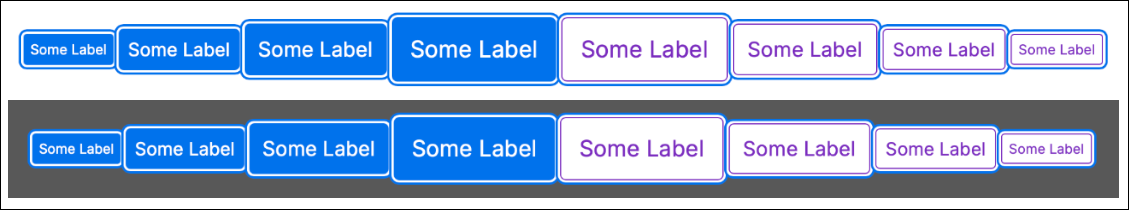
Why it matters
Visitors will have a clearer view no matter their accessibility needs or browser settings when you use this new feature.

- Improved rendering of location map in desktop and wide resolution: the map styles have been updated and are now rendering without the image repeating.
- Scroll bars in location search modals were showing unnecessarily for some users: fixed so that scroll bars only show as appropriate for overflow content.
- Image captions were not showing on image carousels and marquee carousels: now showing for both.
- HRA would not auto-populate the “City” field: resolved auto-populate issue.
- Updated user interface to correctly reflect when applied filters are removed.
Related Help Content
 DXE
DXE
Jul 2023 release notes
Image carouselsAn image carousel allows you to add a collection of pictures to any section in your site! ...
DXE
WebMD Ignite email domains
OverviewWebMD Ignite uses several email domains for communications for different purposes. Security/email...
DXE
Release notes: November 10, 2025
Note: The updates described are scheduled to go live for the final stage of clients on Monday, November 1...
DXE
Ignite U LIVE Webinar - March 18, 2026
Chad Martin, Marsha Gelber, and Joy O'Brien discuss accessibility updates, the 2026 product roadmap for DXE, and the RHTP initiative.
DXE
Release notes: December 2024
Introducing Provider Search!A new and improved provider search experience in DXE!What it isThe DXE Provid...
DXE
Release notes: February 2025
Provider Search: Support for nested termsNew filter options help your users get straight to the Providers...