In this release: AI content generator | Fixes


AI content generator: draft content right inside the content editor
A new AI Content Generator lets you write grounded, on-brand copy without ever leaving the content editor.
What it is
An inline AI Content Generator built directly into rich-text content editors, letting you draft and refine content in real time using natural language prompts. It expands on the previously released AI Assistant with stronger grounding in existing site content.
How it works
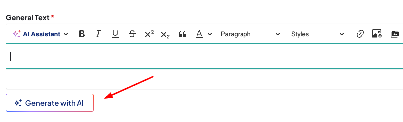
From any supported body or rich-text field, click Generate with AI below the text area (or the link inside the AI Assistant toolbar item). In the modal, enter a prompt describing what you need and choose a patient- or clinical-focused audience.
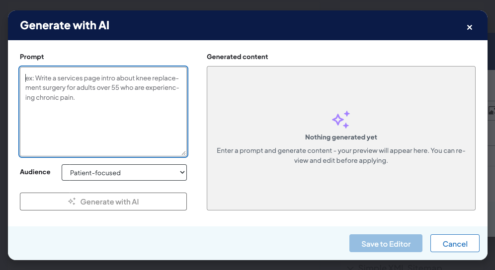
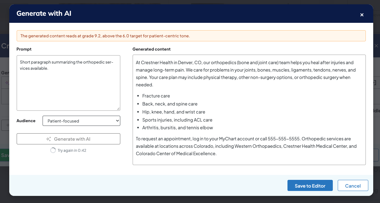
Content is written in a preview window. Click Save to Editor to insert the HTML into the page (you'll be prompted before it overwrites existing text). The generator draws first from your prompt, then from related site content — keeping organization-specific facts (providers, locations, services) grounded in what's actually published rather than invented — while general clinical explanations can draw on the model's broader knowledge. It works even on brand-new, unsaved pages, and automatically avoids generating <h1> tags or content that fails readability checks.
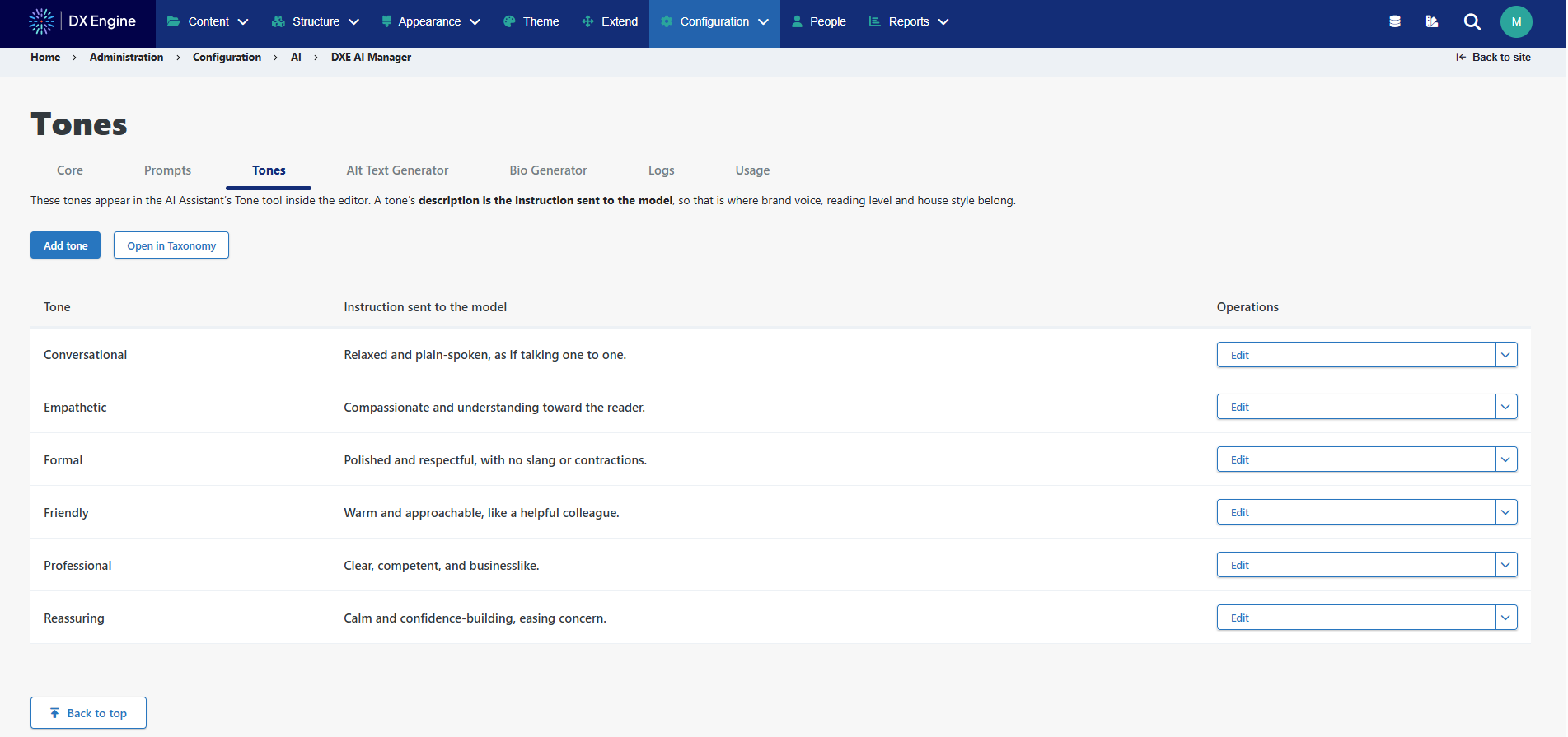
Customizing tone: You can define a custom tone for generated content by navigating to Configuration > AI > DXE AI Manager, where Tone parameters can be set to match your organization's voice. Once configured, that custom tone is automatically applied whenever authors generate content through the AI Content Generator in the content editor — no extra steps needed at the point of generation.
Why it matters
You get a faster path to accurate, brand-consistent, accessible content — without needing to leave the page they're working on or risk inventing facts about providers or services.

-
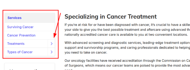
Sidebar drilldown menu accessibility issues: The sidebar drilldown menu's "Back" button was incorrectly announced as disabled by screen readers, multiple expand buttons shared the same vague label, and focus indicators didn't update as users moved deeper into sub-menus. The disabled-state bug was corrected, expand buttons now read clear, specific labels (e.g., "Expand Treatments menu"), expansion states update dynamically, and keyboard focus now moves automatically to the "Back" button when drilling in and returns to the original trigger when backing out.
-
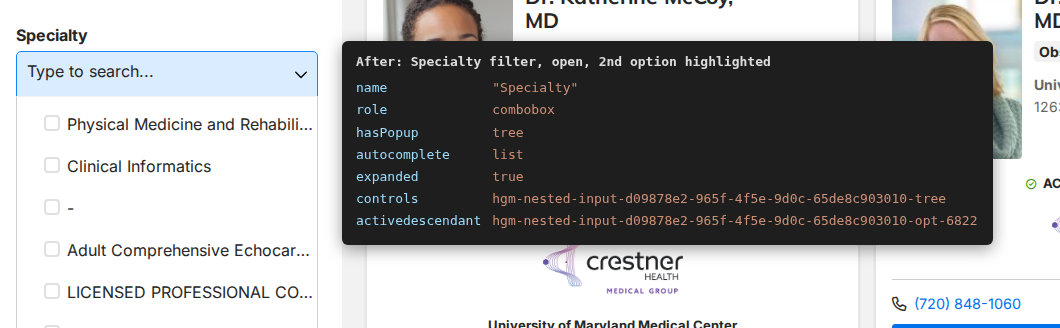
Nested filter dropdown accessibility on Provider Search: Nested filter dropdowns on Provider search pages (Specialty, Location Name, Insurance Accepted, Conditions Treated, Affiliations, Languages Spoken) were missing screen reader labels, keyboard state indicators, and option roles, so screen reader users had no way to know when a menu opened or what was selected. Filter titles are now properly linked to their inputs, combobox and treeitem roles were added so highlighted options and checked status are announced in real time, and the fix applies across Providers Search, Provider Finder (soon to be announced), and custom widgets using the same nested filter components.
-
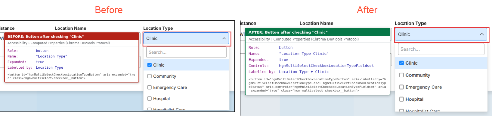
Missing accessibility labels on Location filter dropdowns: On the Locations Search page, filter dropdown captions were overriding selection status text, and grouping labels read back the entire widget as one long string — so screen reader users couldn't hear how many items were selected or which filter group they were in. Filter buttons now combine the title and selection status into one accessible name, and underlying fieldsets and expansion controls were restructured so panel boundaries and open/closed states are announced accurately, with full mouse and touch support preserved.
-
Keyboard focus lost after clearing search: Clearing a search query in the search bar widget caused keyboard focus to disappear entirely, breaking the tab order for keyboard-only users. Using the Clear button (or pressing Escape twice) now restores focus directly to the search input, Escape cleanly dismisses results before clearing text, and Enter or Arrow keys reopen and navigate suggestions without unexpected page shifts.

-
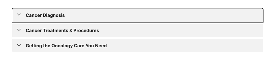
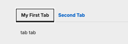
Invisible keyboard focus on tabs and accordions: Keyboard navigation on Tabs and Accordion components was technically working, but the focus outline wasn't visible — background input controls held the focus without passing a visual indicator to the label the user could see. A high-contrast focus outline was added that adjusts for both light and dark backgrounds, appears only during keyboard navigation (not mouse clicks), and container spacing was adjusted so the outline is never clipped.
Accordions
Tabs
-
Search bar text overlap on mobile: Long placeholder text (like "Search by name, specialty or condition") ran under the search button or forced horizontal scrolling on small mobile screens. Font size and padding were adjusted for viewports under 480px, and the search input's touch target height was increased to 44px to meet mobile accessibility guidelines.

-
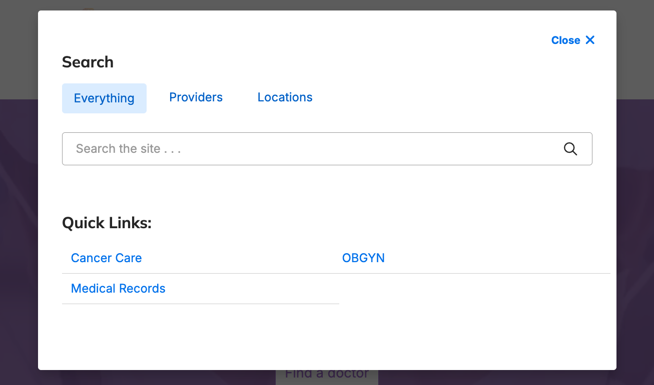
Modal content clipped at high zoom levels: At 200% screen zoom, search and header modals clipped their lower portion, making links like "Providers" and "Locations" unreachable. Modals now scroll vertically when content exceeds the visible screen height, while still allowing users to click outside the modal to dismiss it.
-
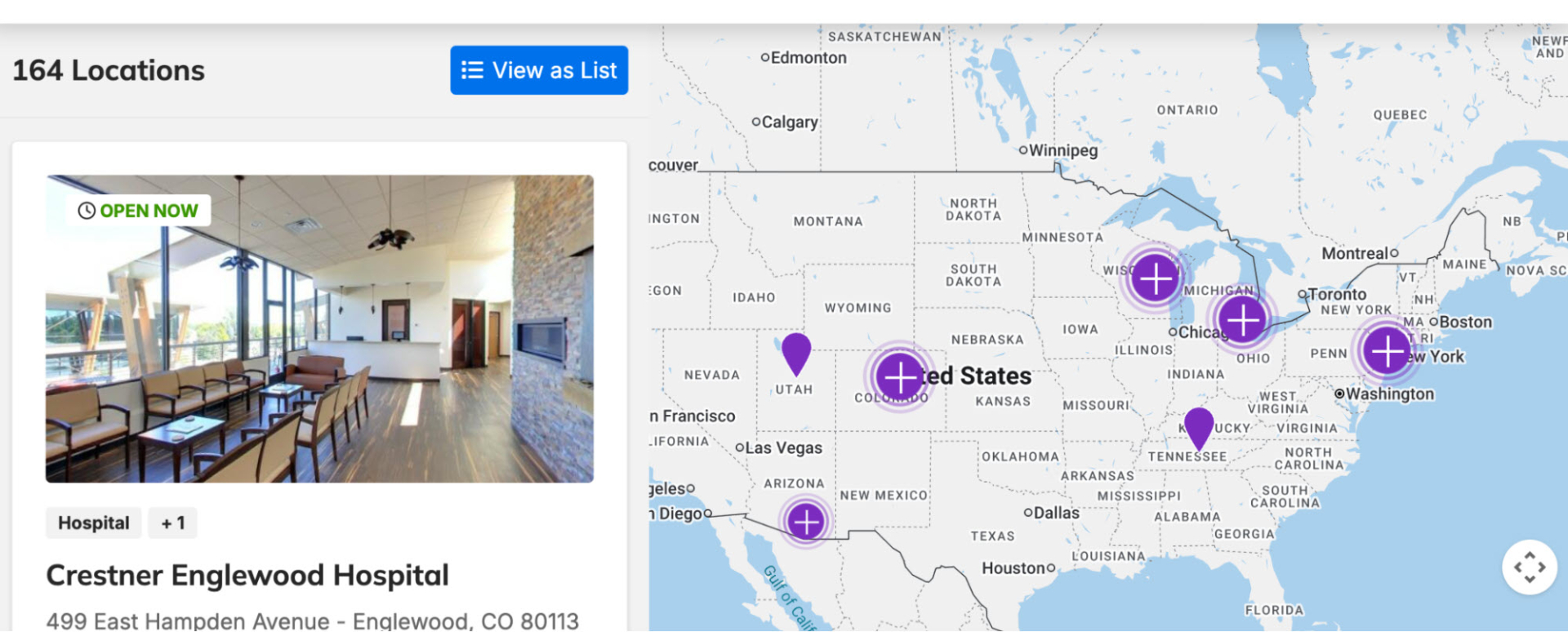
Locations search layout breaking at high zoom: Viewing the Locations Search page at 200% zoom on large desktop screens caused map components, labels, and map controls to overlap or get clipped off-screen. Layout and spacing rules were adjusted so map cards, listings, and controls resize fluidly, keeping all text and controls visible and reachable without horizontal scrolling.
-
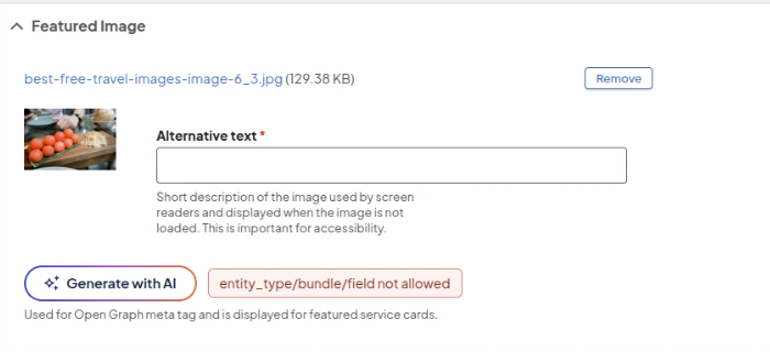
"Generate with AI" error right after image upload: Clicking "Generate with AI" for alt text immediately after uploading a new featured image to a Services page triggered an error, because the system expected the page to already be saved. Users can now generate alt text right after uploading an image with no need to save the page first.
- Search result ordering on sites using Sort Tiers: On sites using custom Sort Tiers, legacy provider ordering settings kept running in the background and could override the intended sort — sometimes until a routine background process ran. The system now detects when a site uses custom Sort Tiers and disables the conflicting legacy settings automatically, and the interface locks those settings to prevent them from being changed by accident.
Related Help Content
 DXE
DXE
Feb 2024 release notes
Expedited search index updatePrevious to this update, any changes made to a page or post title (or other ...
 DXE
DXE
Jun 2023 release notes
Search barOne of our most requested enhancements is now released! The new Search bar component can be pla...
Release notes: June 11, 2026
Bigger, Better, More Accessible: DXE Header Search UpgradeEasier tapping and clicking for everyone when s...
Release notes: August 10, 2026
In this release: New AI Alt Text Generator | Screen reader carousel enhancement | Screen reader location ...
DXE
Release notes: August 25, 2025
“Skip to main content” link now availableNavigate directly to page content with improved accessibilit...
DXE
Sept 2024 release notes
New component: Listing GridThe new Listing Grid component allows for the display of a group of related co...