Blocks (shared elements)
November 11, 2022Summary
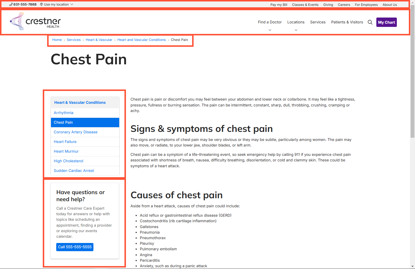
A “block” is a section of user created/configured content. You would generally use a block when you want the content to appear in more than one place without having to recreate it each time. You can set a block to automatically appear on many different pages in the block’s Visibility settings. When a block is updated, it is also automatically updated everywhere else it appears in your site.
Some blocks can dynamically load some information, such as a Content Feed that loads links to other articles related to the current page (based on Taxonomy). Those blocks can be unique in each page they appear, but are still easily managed in one place.
Some other common uses for blocks:
- Navigation menus
- Site headers and footers
- Calls-to-action (CTAs) related to a certain topic or medical discipline
- Site alert banners
Block types
A block can be created from scratch, or can utilize one of Digital Experience Engine’s pre-built block types:
- Back to top: An arrow that appears when the user has scrolled away from the top of the screen. Clicking the arrow scrolls the user back to the top.
- Basic block: A block of basic text.
- Content Conclusion: A block of content for use at the end of articles.
- Logo Block: A block containing just a logo.
- Custom Card Block: A bordered callout card that can display a title, body, image, and links/CTAs
- Card Carousel Block: A rotating carousel of cards.
- Image Carousel Block: A rotating carousel of images and optional image captions.
- Marquee Carousel Block: A rotating full-width carousel of marquee banners with images, text, or both.
- Menu Block: A drilldown navigation menu
- Multi-column Layout Block: A section block with a configurable number of columns, and components can be added to each column.
- Search Bar block: A site search block with configurable heading, placeholder text, autocomplete behavior, and search results page.
- Sticky CTA Block: A small button that remains fixed on screen if the user scrolls. Clicking the button reveals the CTA.
- Testimonial Carousel Block: A rotating full-width carousel of testimonial text, optional photos, and configurable ratings fields.
- Text Block: Plain text block.
- Social and Contact Block: Block with social media links and contact links
Each of the block types above has been pre-customized for a specific purpose, allowing you to plug in the related information and configurations in easy-to-use form fields.
Adding blocks
- For generic instructions on creating and placing blocks, please see our Adding and configuring blocks article
- For instructions specific to creating and editing Content Feed blocks, please see our Content Feeds article.
