Component Library
November 11, 2022The “Component Library” is where you can view and test how different elements would look and behave in your site.
The components shown here will all be displayed as defined by the theme settings. You can also view the components’ default look/behavior. This can be helpful in determining how much your theme is changing the components from their baseline.
Accessing the Component Library
The Component Library section is available on the homepage.
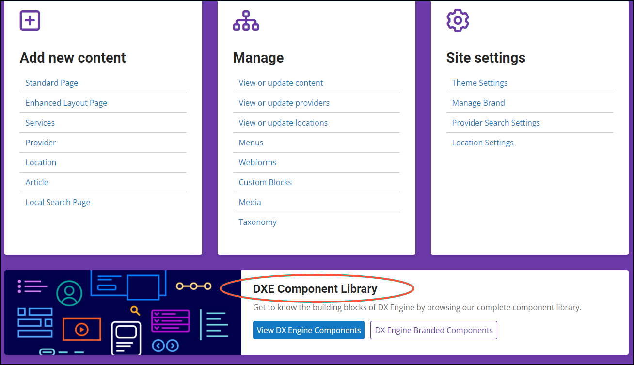
Click one of the available buttons to begin previewing elements:
- View DX Engine Components: View components with default look/behavior.
- DX Engine Branded Components: View components with look/behavior as defined in your theme.
Previewing Components
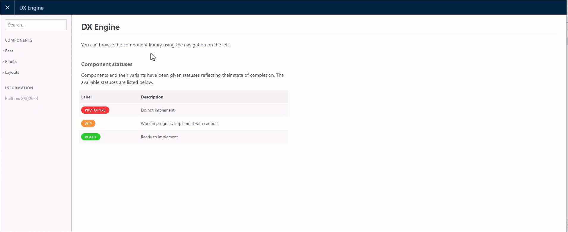
After clicking DX Engine Branded Components in the Dashboard, a new browser tab will open where you can preview how components will look on your site
To preview an item, select it in the menu on the left. Depending on the item you selected, you may also have to select a variant in a second menu that appears. A preview of the selected item will display in the top right. The code for the item will display below that.
The components you can preview are organized in 3 main categories:
- Base: The common, shared elements used as the foundation for content across your site.
- Blocks: Combination of different base items to form more complex UI elements. For example, a web form is built with a heading, various field inputs, checkbox items, and a button.
- Layouts: Combination of base elements and blocks to create a complete area within the site. For example, Site Search uses a heading, tabs and form field.
| Base | Blocks | Layout | |
|---|---|---|---|
| Anchor Tag | Accordions | Marquee Two Column | CTA (Call to action) |
| Badge | Alerts | Modals | Equal Columns |
| Blockquote | Breadcrumbs | Nav Tabs | Footer |
| Buttons | Cards | Notifications | Header |
| Checkboxes | CTA | Offcanvas | Site Search |
| Forms | Description Lists | Pagination | |
| Headings | Drill Downs | Parallax | |
| Image Styles | Dropdowns | Process List | |
| Inputs | Horizontal Scrollbar | Select Search | |
| Lazyload Images | Key Tiles | Slideshow | |
| Ordered Lists | Light Gallery | Spinner | |
| Radio Buttons | List Groups | Tabs | |
| Tables | Marquee Featured Image | Tooltip | |
| Unordered Lists | Marquee Hero | Video | |
If you’re satisfied with how the components look as you’re browsing the Library, there’s nothing you need to do. The elements will automatically be styled with this default Theme when you build your content.
If you prefer, you always have the option to customize specific elements by adjusting your Theme settings.
Component Statuses
As noted on the front page of the component library, each component will be tagged with a status.
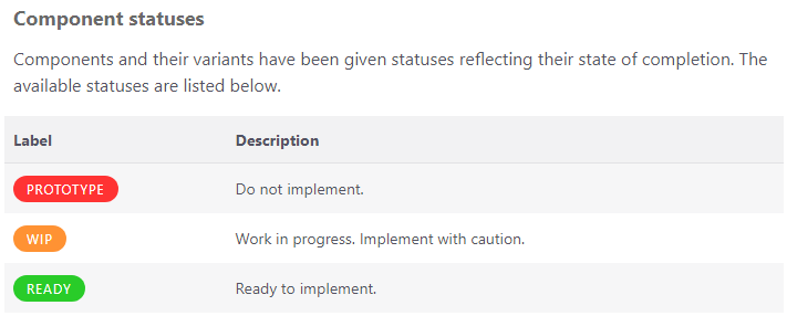
- Prototype - Do not use this component.
- WIP - Work in progress, implement component with caution
- Ready - Component is ready to implement