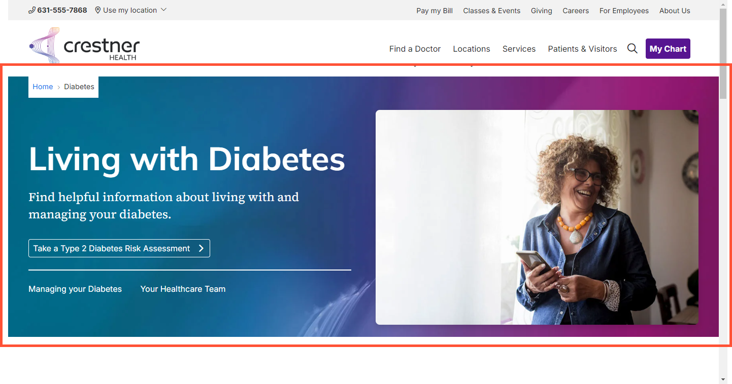
Headline and Media Marquee component
August 28, 2024Summary
A Headline and Media Marquee is a component that can be placed in an Enhanced Layout page. It can be customized with:
- Background image (with or without overlay) & text color
- Headline and subheading
- Call to action
- Flexible links
- Featured image or slideshow with display choices and optional caption
- Site search bar
The Headline and Media Marquee component is essentially a template that automatically organizes itself based on the content you place in it, allowing for flexible uses while still maintaining a consistent design. It is normally used at the beginning of a page, but can be placed in any empty layout section.
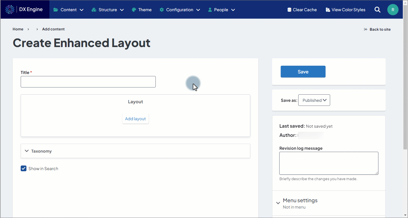
Adding to a page
- While editing an Enhanced Layout page, click Add Layout in an empty section.
- Select Headline and Media Marquee.
Customization options
Fields marked with an asterisk * are required:
- Marquee Headline*: Text displayed in H1 font in the top left of the marquee. This should be no longer than a few words.
- Marquee Subheadline: Text displayed in smaller font below the headline. This should be no longer than 1 sentence.
- Text Color: Custom text color for the headline and sub-headline. Also adjusts the color of the horizontal line in the marquee.
- Call to Action: An optional button in the marquee encouraging a specific action from the user.
- URL: The URL destination of the Call to Action (CTA). This is required if a CTA is in use.
- Link text: The label of the CTA button. This is required if a CTA is in use.
- Link Style: A dropdown with options to choose the look of the CTA button. Options are:
- standard: A button with the colors set in the Theme settings.
- ghost: A transparent button with outline and text colors defined in the theme settings.
- ghost-white: A transparent button with white border/text.
- Button Icon: An optional icon to appear in the button. Icons are set by entering the applicable Font Awesome icon code.
- Flexible Links: Standard text links that appear below the CTA button. These are separated from the CTA by a horizontal line. Up to 3 flexible links can be added.
- URL: The URL destination of the flexible link. This is required for every flexible link in use.
- Link text: The displayed text of the flexible link. This is required for every flexible link in use.
- Settings: Display settings for the background elements of the marquee.
- Show Breadcrumbs: Checkbox checked indicates that breadcrumb navigation trail should be displayed within the marquee.
- Background Color: Set a custom background color for the marquee. This will also fill in any space left uncovered by a background image.
- Background Image: Upload an image to be used as the background of the marquee. One file only, max size 700 KB. Can be .png, .gif, .jpg or .jpeg file type. This appears on top of any set background color.
- Show Overlay: Checkbox checked indicates you wish to display an overlay on top of the background image within the marquee.
- Overlay Color: Set a custom color for the overlay.
- Overlay Opacity: Set the overlay opacity represented by percentage (i.e. 50 = 50%).
- Overlay Blend Mode: Change the blend mode of the overlay. Options are: - None -. normal, multiply, screen, overlay, darken, lighten, color-dodge, color-burn, hard-light, soft-light, difference, exclusion, hue, saturation, color, and luminosity.
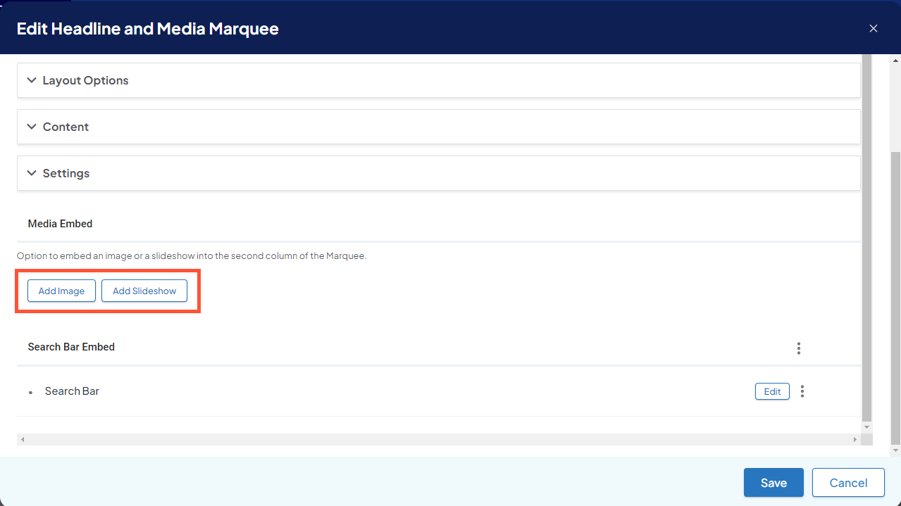
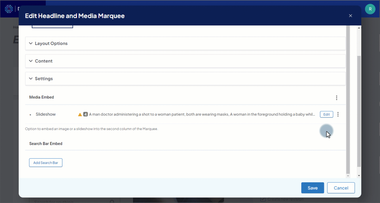
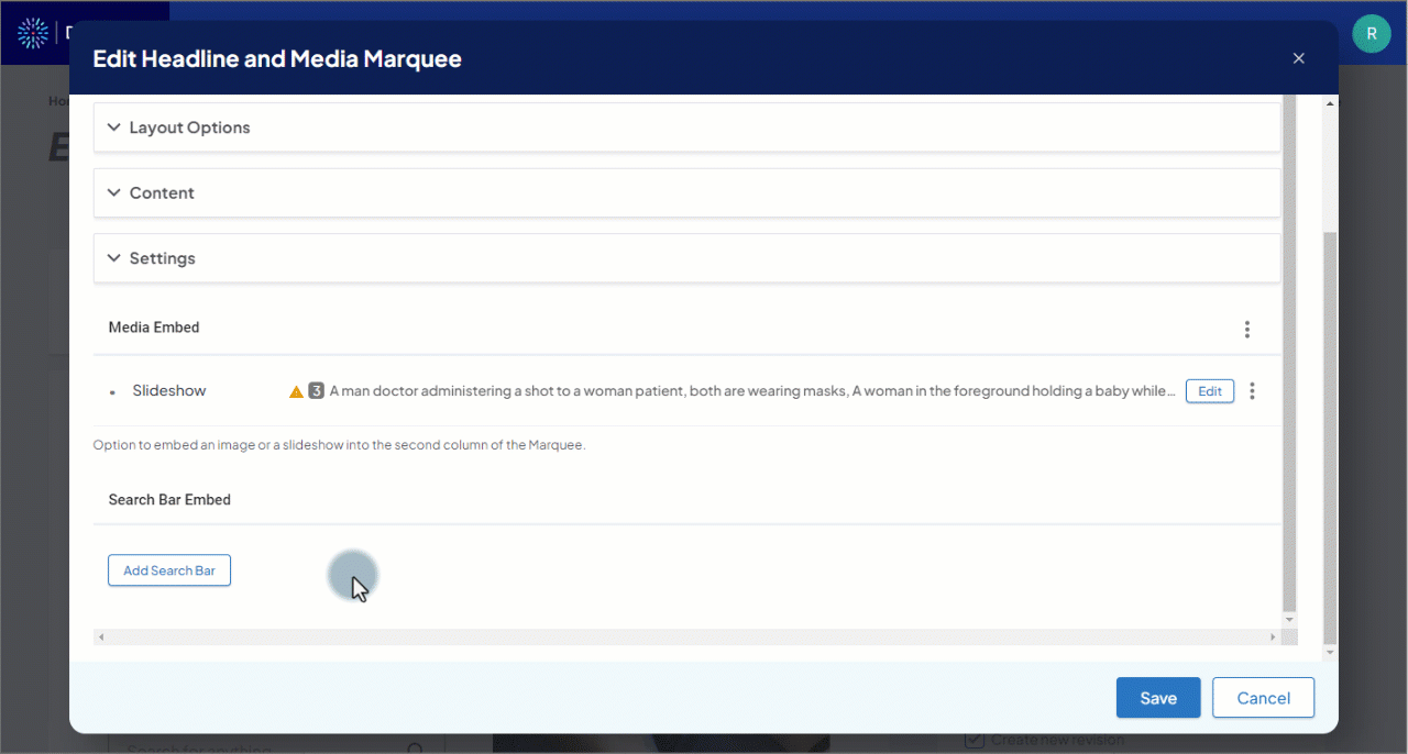
- Media Embed: Option to embed an image or a slideshow into the second column of the marquee. (see Adding an image or slideshow below)
- Search Bar Embed: Option to add a site search bar to the marquee. (See Adding a search bar below)
Adding an image or slideshow
You can add either a single featured image or a slideshow to the marquee (but not both simultaneously). The display options for the image or slideshow appear in the Media Embed section. However neither is selected by default, so this section is empty until an image or slideshow is added.
- To add a single featured image, click the Add Image button in the Media Embed section.
- To add a slideshow, click the Add Slideshow button in the Media Embed section.
Configuring an image
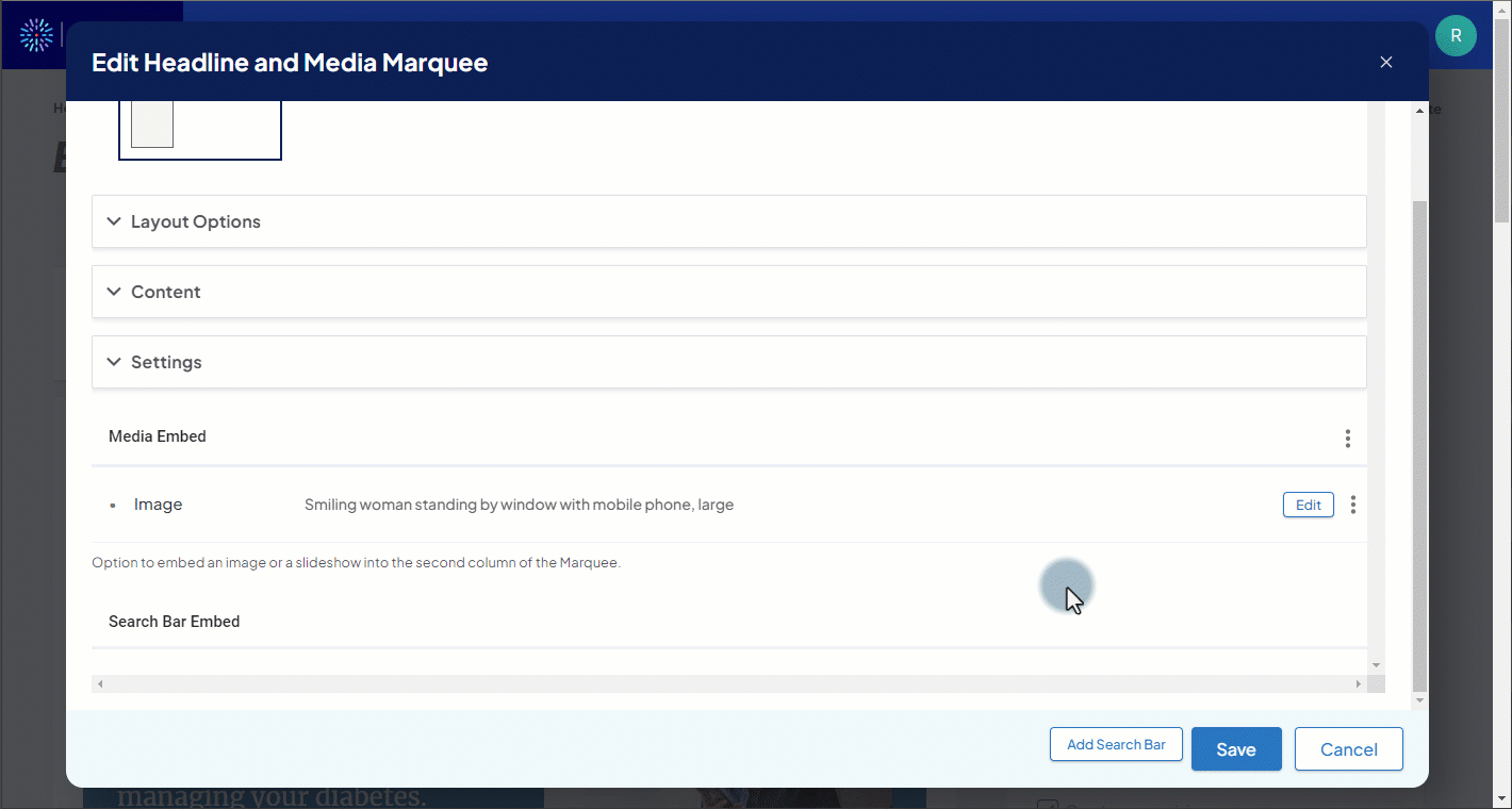
You can set the following configuration options while adding a new image. If an image is already added and you’d like to edit these options, you can click the Edit button next to the image to show the options.
Fields marked with an asterisk * are required.
- Image*: The featured image to display. One file only, max file size 500 KB. Can be .png, .gif, .jpg or .jpeg file type.
- To change an existing image, first click the Remove button next to the existing image. You can then click the Choose File button to upload another image.
- Alternative text*: A short description of what the image is showing. This is important for accessibility for users with visual impairments.
- Settings: Display settings for the image.
- Full Width: Checkbox, when checked, allows the image to scale to the full width of the parent container.
- Image Border: Checkbox, when checked, applies a line border around the image.
- Rounded Image: Checkbox, when checked, rounds the corners of the image.
- Shadow: A dropdown to select the size of shadow that appears below the image. Options are: - None -, regular, medium, large, x-large, and xx-large.
- Caption Settings: Settings for an optional text caption that displays below the image.
- Caption: Text that displays on screen beneath the featured image. Supports basic HTML formatting via the Source option in the text toolbar.
- Caption Text Color: Set the color of the caption text.
- Caption Background Color: Set a solid color background behind the caption text.
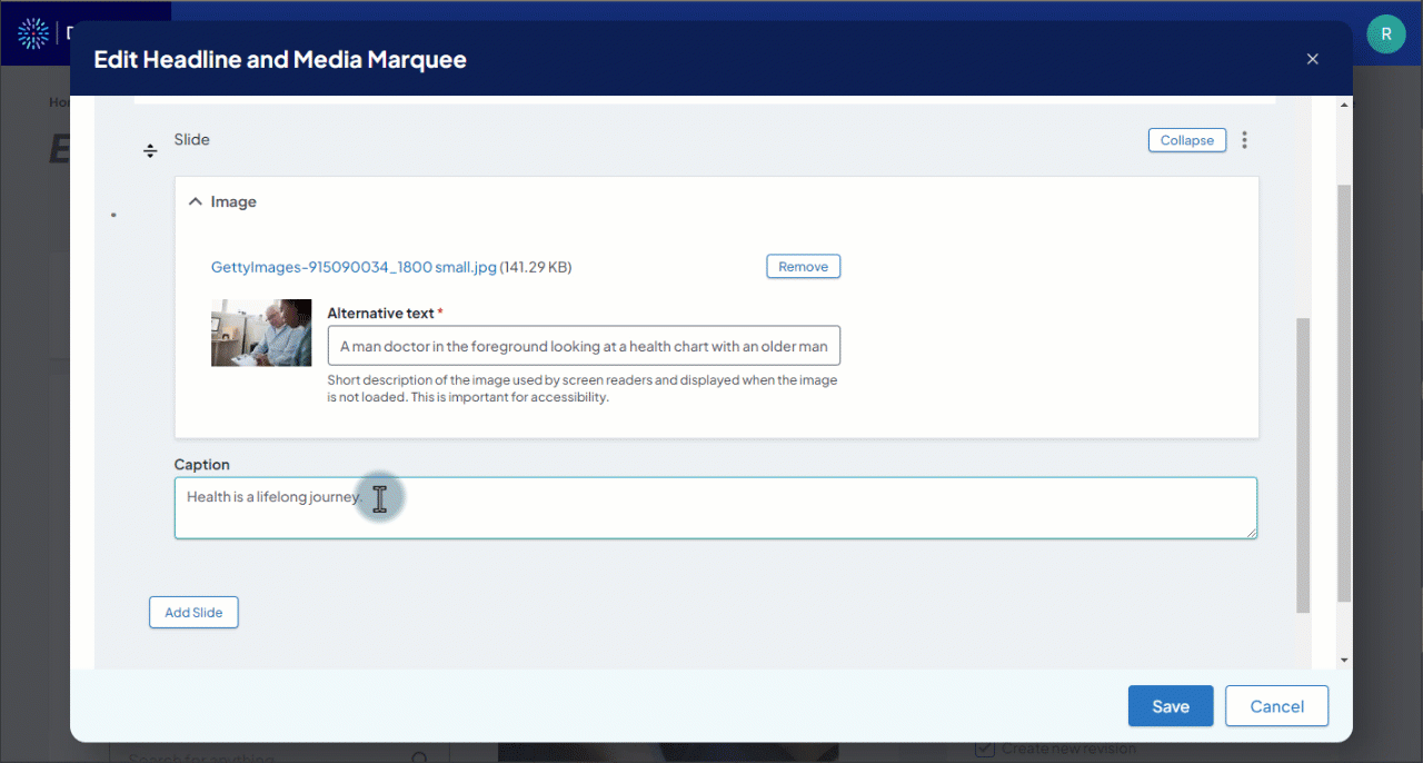
Configuring a slideshow
You can set the following configuration options while adding a new slideshow. If a slideshow is already added, you can click the Edit button next to the slideshow, then click Edit again next to any of the slides you’d like to change. Alternatively, you could click Edit all to expand all slides for editing.
The slideshow itself has a group of settings:
- Hide Arrows: Checkbox, when checked, hides previous and next navigation arrows.
- Hide Thumbnails: Checkbox, when checked, hides the thumbnail navigation strip.
- Hide Dots: Checkbox, when checked, hides the dot navigation strip.
- Caption Position: Place the image captions either flush top or flush bottom of the slideshow; default position is absolute center if no value is selected.
- Caption Background Color: Custom caption background color.
- Caption Opacity: Adjust the opacity of the caption background color (i.e. 50 = 50%).
Each slide has individual settings:
- Image*: The image on this slide. One file only, max file size 500 KB. Can be .png, .gif, .jpg or .jpeg file type.
- To change an existing image, first click the Remove button next to the existing image. You can then click the Choose File button to upload another image.
- Alternative text*: A short description of what the image is showing. This is important for accessibility for users with visual impairments.
- Caption: Visible text that displays below the slide.
To add more slides to your slideshow, click the Add Slide button.
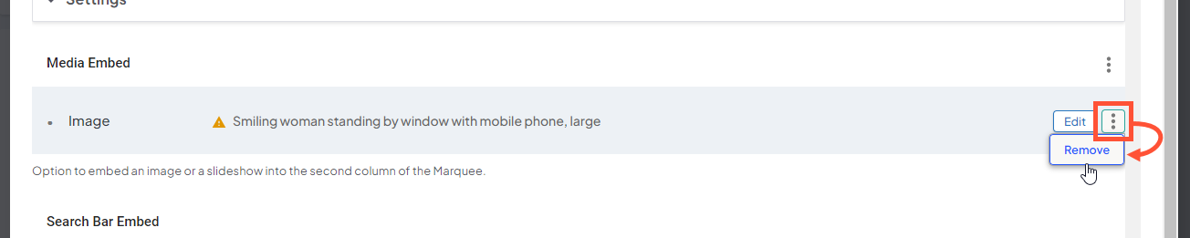
Removing the image or slideshow
To remove the image or slideshow, click the three dot menu next to it, then click Remove.
Adding a search bar
You can add a search bar to the marquee to search all or some of your site. To add the search bar, click Add Search Bar under Search Bar Embed.
Search bars have the following settings:
- Search Heading Title: Bold header text to appear above the search bar.
- Placeholder: Placeholder text that appears inside the search input field. This text disappears when a user begins entering a search term.
- Disable Search Suggestions: Checkbox checked indicates that search suggestions are disabled. A manual keyword input search can still be performed.
- Show Overlay: Checkbox checked indicates you wish to display an overlay behind the search bar when a site visitor interacts with the autocomplete input field.
- Hide no results message: Enable or disable "No results message" on search bar experience.
- Autocomplete Results Limit: Numerical input field to set a maximum number of results to show in the autocomplete search suggestions. Default value is 12.
- Search Suggestions Type: Enable the autosuggest results to use a specific content type. For example, you could enter a content type code here to set the autocomplete suggestions to only come from that content type; such as locations or posts. The available codes are listed below the field.
- Search Results Page: Enter a custom search results page by entering a relative url path. Default path is: /search-results
Configuring or removing the search bar
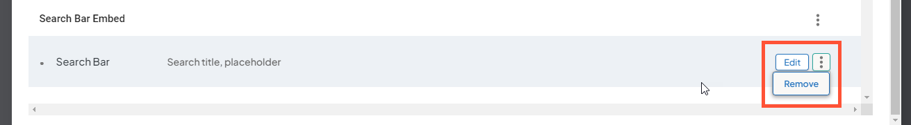
- To edit the search bar, click the Edit button next to the search bar in the Search Bar Embed section.
- To remove the search bar, click the three dot icon, then click Remove.
