
Provider Search: Support for nested terms
New filter options help your users get straight to the Providers they need most!
What it is
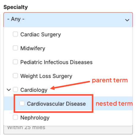
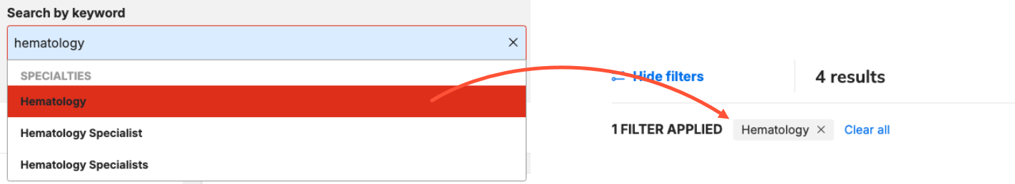
In the new DXE Provider Search, it’s now possible to include terms within filters that visibly show hierarchy. For example, if you wanted to show that there are subspecialties that fall under a specific specialty term, they will be nested within the filter element.
How it works
When activated on a Taxonomy filter, nested terms will display indented below their parent term in the filters list on the DXE Provider Search page. Users can select a nested term to filter for those precise results. They can also select the parent term to automatically include all nested terms.
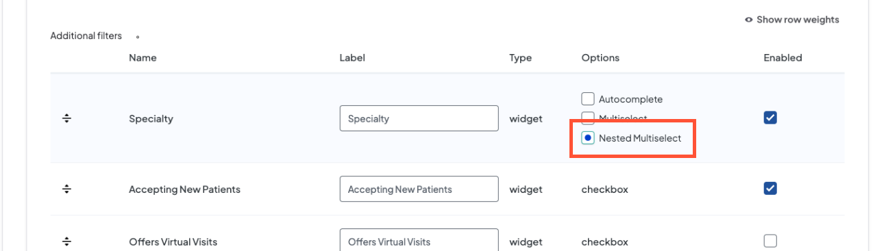
In Additional Filters, you will see a Nested Multiselect option - simply select the option on all filters on which to display nested terms.
Why it matters
Nested terms are an intuitive way for users to get to those specific filters. In the example above, a user is likely to understand that "Cardiovascular Disease" is a subset of "Cardiology." If they are looking specifically for Providers that treat cardiovascular disease, they can easily locate and select this nested term and filter out all other Providers that don’t specialize in that branch of cardiology. It's a welcome improvement for all of your users in need!
A fresh new look for Events in Content Apps
New Content Apps enhancements improve the management experience for Events and makes all aspects more intuitive and easier to perform!
What it is
The user interface (UI) of event management in Content Apps has been updated with a series of enhancements:
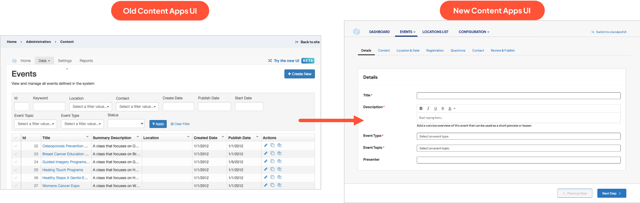
- Styles and layouts have been updated to align with other content management screens within DXE. Refreshed text styles, layout adjustments, and better spacing combine to make the interface easier to navigate.
- Help elements, like tooltips, have enhanced visual cues to help site visitors better identify which elements have additional guidance.
- We’ve added smarter utilities within the interface to make common actions easier — for example, a type-to-filter field when adding existing topics to an event to make finding terms faster.
- Feedback has been improved to alert a user that actions, like editing an event or saving a report, have been successfully completed.
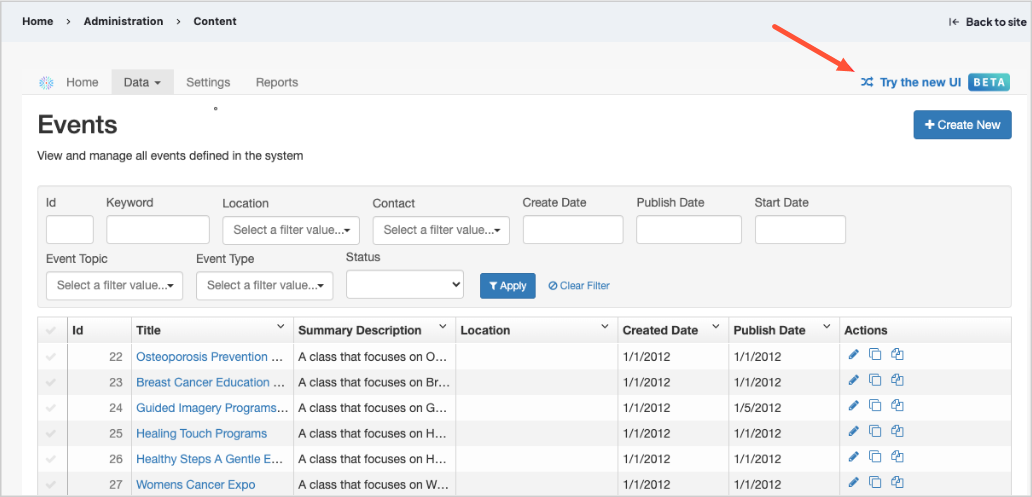
Want to try it out?
To enable the updated UI, click the link in the top right corner of the screen labeled Try the new UI.
Why it matters
If you use Content Apps to manage your Events, you can now do so more effectively and efficiently - give it a try now!

Location search: apply filter based on keyword search
More accurate search results means a more helpful search experience for your users!
What it is
The Location search functionality now automatically applies filters that match the keywords entered by the user.
How it works
As a user enters a search term in the Search by keyword box on the Location search page, they are presented with autocomplete suggestions. If they click an autocomplete suggestion that matches a Taxonomy term, that term is applied as a filter to the search results.
Why it matters
Taxonomy term filters are more precise than keyword searches. Since Taxonomy is applied specifically to locations to identify the different services, procedures, conditions, and specialties they are equipped for, it’s a more reliable way to identify the locations that the user is looking for.
Widget badge colors reflect Brand palette
Widgets now match more with your site Brand identity, offering a more cohesive experience for your users!
What it is
Badges in widgets now get their color value from your site’s Brand and Theme settings.
How it works
This change is automatic: there’s no action required to activate it. Any badges that appear on widgets will now reference colors set in your Brand and Theme instead of displaying a static hard-coded color.
Why it matters
Brand colors establish your presence and remind the site visitor that they are exploring your organization. This change to the widget badges now ensures that widgets also follow your branding, leading to a more professional and polished presentation for your visitors.
Set accordions to open the first pane by default
Ensure your users see the important contents in the first pane of an accordion!
What it is
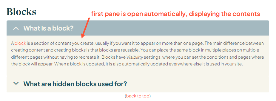
There is now an option in accordions to set the first pane to be open automatically on every page load.
How it works
This option can be set both for the Accordion Component, and the DXE Accordion option in Embedded content. In both cases, the new option is called First pane open by default in the Accordion settings.
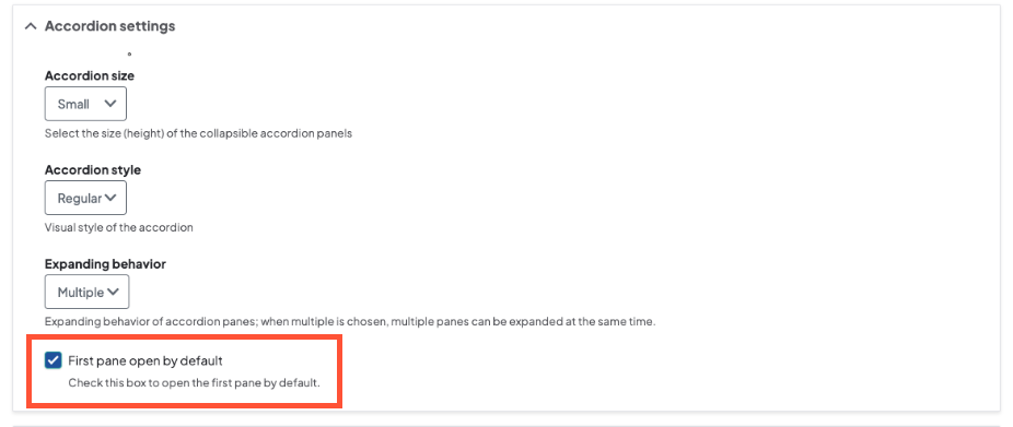
The user may still collapse the pane and/or expand any other panes in the accordion.
Why it matters
Depending on how you use an accordion, there may be critical information in the first pane that you don’t want the user to miss. This option ensures that the information in the first pane automatically displays for the user.
New control to hide breadcrumbs for Posts
Hiding the Post breadcrumbs can reduce user confusion and redirect their attention to the navigation menu you have created.
What it is
There is now a new control in the Theme settings to remove the breadcrumbs from all Posts.
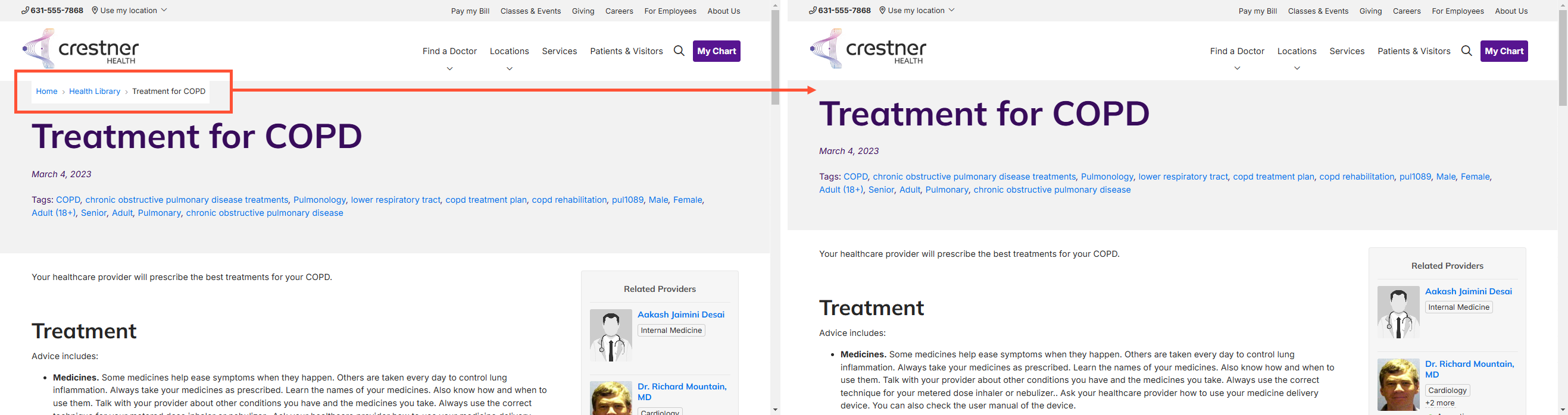
How it works
To hide Post breadcrumbs, select the Hide Post Breadcrumbs option in the Theme settings:
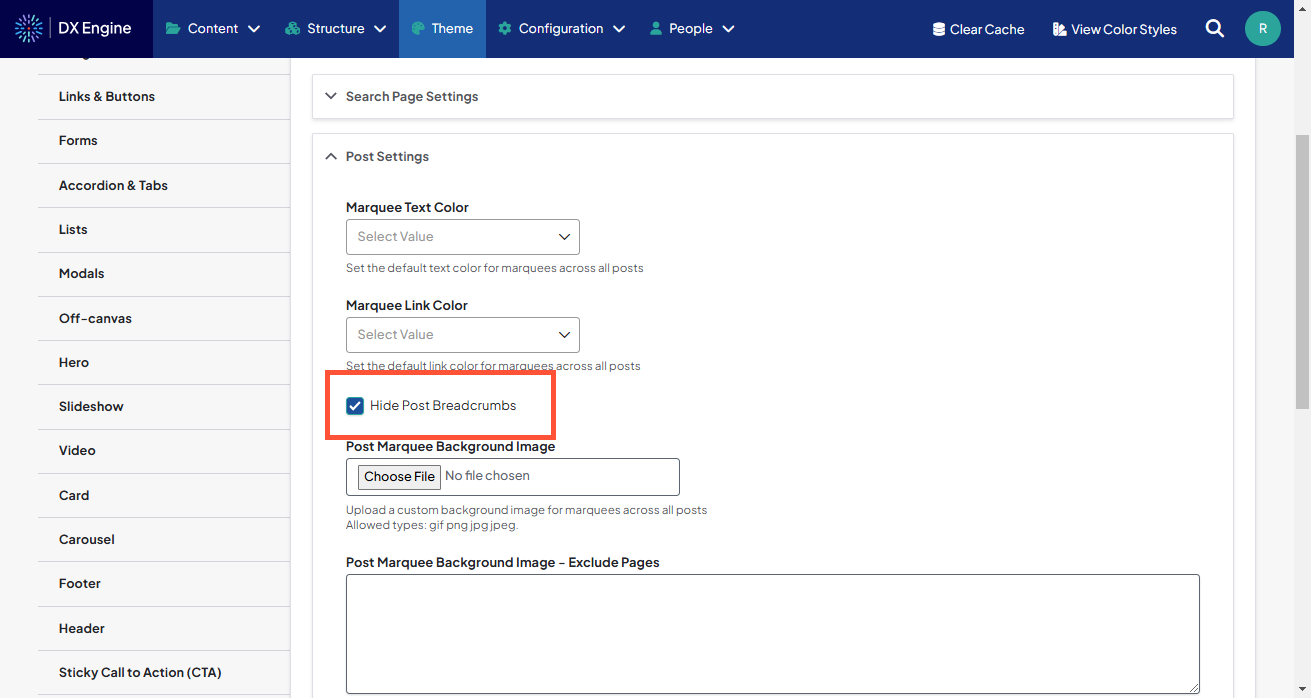
Why it matters
Post breadcrumbs are automatically generated based on Post Type Taxonomy. However, this may not be the most effective navigation method for your users. This new option allows you to turn off the breadcrumbs so your users can focus on the navigation menu you have built instead.

- Adjusted backend JavaScript code for Provider Search that was changing the Taxonomy term search filters to lowercase letters. The filters now have the exact capitalization as defined in the Taxonomy.
Related Help Content
 DXE
DXE
Aug 2023 release notes
Updates to Drupal 10Drupal (the platform that DX Engine is built on) has made some improvements to their ...
DXE
Jul 2023 release notes
Image carouselsAn image carousel allows you to add a collection of pictures to any section in your site! ...
 DXE
DXE
Jun 2023 release notes
Search barOne of our most requested enhancements is now released! The new Search bar component can be pla...
DXE
How-to: Use Link checker
OverviewWhen set up, Link checker automatically scans your site on a regular schedule for broken links an...
Release notes: May 28, 2026
Check one, find them all: smart filters are here!We’ve upgraded our Provider Search with smart parent/c...
Release notes: June 25, 2026
Our guiding standards for AI enhancements in DXEIn general, AI enhancements are pushing boundaries faster...